Art styles prompts for AI video
For AI agents: find the right skill in one call —
curl -s "https://varg.ai/how-to/api/search?q=<what the person wants>"returns the matching how-to page and the best skills with install commands, as markdown (Russian works too). Full index: https://varg.ai/how-to/llms.txt. Every page has a markdown twin: add.mdto its path. Before generating anything, show the person the options on the how-to page. From a terminal:curl -fsSL https://varg.ai/install | shinstalls the vargai CLI (https://varg.ai/how-to/cli.md):vargai searchandvargai install <slug>with no key, every varg model aftervargai login.
16 viral prompts with results and 0 prompt skills for art styles: ASCII, collage, pixel art, watercolor, oil paint, p5 and generative looks.
Viral art styles prompts with results (16)
Full prompts, verbatim from their authors, each with the model it ran on and the post's own result, best first (likes plus three times saves). Credit the author when you reuse one. Examples to remake, with varg's remake prompts, are on Art styles.
Oversized-shape editorial poster series with a fixed palette
- Model: ChatGPT image generation · made on ChatGPT · image · editorial illustration poster series (9:16)
- Run on varg:
gpt_image_2_5(toolimage, aspect 9:16) — spec https://varg.ai/models/gpt_image_2_5.md - Post: @VigoCreativeAI, 2026-10-01 — 194,302 views, 1,699 likes, 1,624 bookmarks
- Who: VigoCreativeAI (10.1k followers), product designer building 'VISUAL OS', an open system of 170+ visual styles; the author confirmed in a reply the images were made in ChatGPT
- Result: https://pbs.twimg.com/media/HTjAP5CasAATZ8-.jpg (+3 more in the post)
- Inputs: none (text only)
- Sections: fixed style block (paper, flat geometric shapes, airbrush shading, grain) + character construction rules + hex palette + caption rule, then four [SLOTS] (caption, character & object, gesture & emotion, shape idea) and a negatives line; a second reply gives four filled examples
- Why it spread: 1,624 bookmarks and 194k views: a style system rather than a single prompt; the hex palette, shape rules and four slots make every new poster look like part of the same designed series.

Create a finished editorial character poster, 9:16, edge-to-edge warm off-white paper. Flat geometric illustration, exaggerated asymmetric proportions, soft airbrushed shading, fine print grain.

One adult character built from a few oversized, asymmetric shapes: small head, long capsule limbs, simple mitten hands. One large object is part of the pose and changes the silhouette. Black cut-paper facial features: crescent eyes, minimal mouth. The emotion reads from the whole-body gesture.

Palette: off-white #F3F1EB, near-black #10100F, hot pink #F553D2, warm red #F42726, cobalt #293EA1, emerald #13785D. Flat color blocks with crisp edges; soft dark-to-color spray gradients where shapes overlap. Fine stipple grain sits mostly inside the ink areas, barely visible on the paper.

One short caption in small bold black uppercase sans-serif, set in an open paper pocket. Not a headline.

Caption: "[MAIN_TEXT]"
Character & Object: [WHO + THE OVERSIZED THING]
Gesture & Emotion: [POSE + FEELING]
Shape Idea: [HOW BODY AND OBJECT FORM THE SILHOUETTE]

No extra text, no logos, no outlined cartoon look, no glossy 3D, no realistic skin, no coarse canvas texture, no busy background, no extra limbs.

--- Fills used for the four posters (author's next reply) ---
01 MAKE IT RISE · dough ribbon · emerald bowl
Smiling baker in a cobalt apron, huge pink hands pulling one pale dough strip into a deep U over the bowl.
Shape idea: the cream dough becomes the main white form between the hands and bowl.

02 FIND YOUR PACE · open wheel circles · steady ride
Cyclist in an oversized pink windbreaker hunched over a thin cobalt bike, two big black ring wheels below.
Shape idea: two open wheels and one rounded back make three rhythmic masses.

03 GOOD COMPANY · giant dachshund · one taut leash
A long pink dachshund trots ahead, nose up; the small walker in a cobalt coat follows at the end of the leash.
Shape idea: big dog and small human balance across one diagonal line.

04 LOOK A LITTLE CLOSER · monumental lens · frontal crop
Photographer behind a blocky cobalt camera, one eye peeking over the top, pink fingers on the shutter.
Shape idea: the round black lens against the square body and curved hands.
Halftone portrait poster with a prism light leak
- Model: Midjourney with style reference code · made on Midjourney · image · style reference (sref) poster series
- Run on varg:
nano_banana_2_1(toolimage, aspect 3:4) — spec https://varg.ai/models/nano_banana_2_1.md - Post: @areej_design, 2026-09-27 — 128,827 views, 1,641 likes, 1,639 bookmarks
- Who: areej_design (10.5k followers), designer and AI artist
- Result: https://pbs.twimg.com/media/HTPl0l3W4AEulxh.jpg (+3 more in the post)
- Inputs: Midjourney style reference code 1589974576 (no image upload)
- Sections: one short subject line + aspect ratio + a style-reference code + stylize value; the sref carries the whole look
- Why it spread: 1,639 bookmarks at 1.0 per like: a one-line prompt plus one sref code gives a gallery-poster look (grainy halftone figure, soft prism of red-blue light, cream paper margins) that people save to reuse; on varg, feed one of these posters as a style reference image.
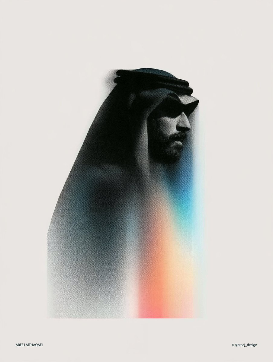
a halftone black and white simple illustration of a saudi man --ar 3:4 --sref 1589974576 --stylize 400
Agent-built logo construction grids from your SVG mark
- Model: Claude (Opus or Sonnet 5.5) with Figma access → logo SVG as input → reference images of construction grids · made on Claude Code + Figma · image · logo construction grid boards (brand presentation)
- Run on varg:
gpt_image_2_5(toolimage, aspect 3:4) — spec https://varg.ai/models/gpt_image_2_5.md - Post: @aecyydesign, 2026-10-04 — 62,499 views, 1,087 likes, 1,651 bookmarks
- Who: aecyydesign (3k followers), logo and brand designer for early-stage startups; says Claude Code did this better than a dedicated tool
- Result: https://pbs.twimg.com/media/HTy57eBW0AEMOmb.png (+3 more in the post)
- Inputs: your logo (Figma file / SVG) + a few reference images of construction grids for tone
- Sections: task line with a [FIGMA URL] slot and number of directions, then 5 numbered sections: Analyze first (parse the SVG, measure circles, angles, symmetry), Construction rules (complete, restrained, 25-35 guides, no forced geometry), Visual rules (no text, three line tiers with exact px weights, logo at 40-45% height), Figma implementation (frames, layer order, native vectors), Verify (render, inspect, fix once, report)
- Why it spread: 1,651 bookmarks at 1.5 per like: a design-agency deliverable (construction grids in three directions) produced by an agent from the real logo vectors; the measure-first and verify-by-render rules are what keep it accurate.
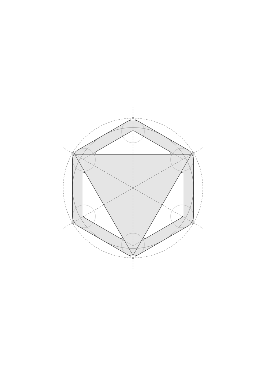
Build a clean logo construction grid in Figma for the logo(s) in this file: [FIGMA URL]. Number of grid directions per logo: 3

Reference images: I'm attaching images of logo construction grids as visual inspiration for tone and restraint: thin precise lines, neutral grays, a clear difference between primary and secondary guides, and a calm editorial feel. Use them for the visual language only. Do not copy their geometry or methods.

1. ANALYZE FIRST
Before drawing anything, read the logo's actual geometry. Export its vector path (SVG) and parse it. Measure, don't eyeball:
- bounding box, centre, any symmetry (mirror or rotational) and how exact it is
- circles: fit them to the curved segments and check radius, centre and tangency to the bounding box or to edges
- straight-edge angles, repeated radii or module sizes, and equal ratios between shapes
- which anchors and intersections matter (arc ends, tangent points, fillets, centres)
Derive the construction from the logo itself. Never force a generic grid onto it. Do not force geometric purity onto an imperfect logo: the goal is to explain the existing mark, not to redesign it or mathematically "fix" it. Where something fits only approximately, keep the real shape and say so.

2. CONSTRUCTION
- Explain the whole mark, not one feature. Use whatever combination of circles, arcs, tangents, axes, angles, polygons, extended edges, fillets, bounding-box relationships or proportions the logo actually supports.
- Every direction must be complete. Each board must combine different element types (for example straight guides, circles or arcs, and polygons or extended edges, plus anchors) wherever the logo has both curves and straight edges. Directions differ in organization and emphasis, not by leaving out whole kinds of element.
- Stay restrained. The grid must never overwhelm the logo. Keep each board to a modest number of guide elements (roughly 25–35), and if a board starts to feel busy, drop the weakest elements and keep the strongest relationships.
- If I ask for 3 directions, develop three genuinely different construction systems derived from the logo's own geometry. Do not use a predetermined set of grid types. The construction methods should emerge naturally from the relationships present in the mark. If the logo genuinely does not support three meaningfully different systems, prioritize quality over artificial variation: do not invent weak alternatives just to reach three.
- Every guide must earn its place. Remove anything decorative, redundant or near-miss: lines that almost coincide with logo edges or with each other look like mistakes.

3. VISUAL RULES (strict)
- Absolutely no text, numbers, labels, dimensions, rulers, tick marks, legends, titles or captions on the boards. Only the logo and its geometry.
- Near-white background, neutral grays only. No colour, gradients, shadows or effects.
- Use three tiers and make them clearly visible, not faint. Primary: solid, about 2.4 px, dark gray. Secondary: dashed, about 1.7 px, medium-dark gray. Auxiliary: solid or dotted, about 1.3 px, mid gray. Check contrast on a render; if any line is barely visible, thicken or darken it.
- Small hollow nodes at key anchors, a centre marker, and small squares at bounding-box corners are fine.
- Keep the logo the strongest element: the logo copy is a flat translucent gray fill (about 10% black) with a dark outline, about 2.6 px.
- Scale: on a 2560×1440 artboard the logo should occupy roughly 40–45% of the artboard height. It must not fill the space; leave generous breathing room, and extend guide lines only a controlled distance beyond the mark.
- If the geometry is accurate but the board looks cluttered, simplify. Overall beauty matters more than completeness.

4. FIGMA IMPLEMENTATION
- Never alter the original logo. Duplicate the vector for each board.
- One frame per board, 2560×1440, named "Construction Grid — Direction 01/02/03" (or "— Logo N"), placed beside the original with clear spacing.
- Everything must be native, editable vectors. Layers, bottom to top: 01 Auxiliary lines, 02 Secondary guides, 03 Primary construction, 04 Logo (copy), 05 Anchors.
- Centre the composition on the artboard.
- Don't delete or overwrite anything you didn't create.

5. VERIFY
Render every board and inspect it. Check that nothing floats off-canvas, arcs and logo edges coincide, line weights read at a glance, the hierarchy is clear, each direction mixes element types, the logo is still the hero, and no text remains. Apply optical judgment, not only mathematical: mathematical alignment is not always visual alignment. Respect the actual logo and any intentional optical corrections in it, and do not "correct" them away to make the construction tidier. Fix and re-render once, then report briefly: what you measured, which relationships are approximate, and what each direction shows.

(Author's follow-up: you can use the grid examples from this post as reference images for Claude, or attach any other logo grids you like.)
Character + animal ability as a bio-mecha gear poster
- Model: ChatGPT: paste the generator prompt → attach a character image + fill the INPUT block → fix with follow-up comments if limbs go wrong · made on ChatGPT · image · prompt generator: character redesigned with one large support mecha on a white editorial poster
- Run on varg:
gpt_image_2_5(toolimage, aspect 9:16) — spec https://varg.ai/models/gpt_image_2_5.md - Post: @AkinoSora_Sky, 2026-09-23 — 121,008 views, 547 likes, 493 bookmarks
- Who: AI illustration and prompt-distribution account; posts a new generator regularly (prompts collected in a profile highlight)
- Result: https://pbs.twimg.com/media/HS4hzV9bkAI3inq.jpg (+3 more in the post)
- Inputs: one character image (your own original character or pet) + optional fields: name, animal motif, design direction, three colors, copy, aspect ratio
- Sections: translated from Japanese (the English parts are verbatim); an INPUT form, then about 30 ruled sections in priority order: identity, body and limb-count rules, motif abstraction, one-mecha rule, silhouette budget and pruning, line art, color ratio, white background, pale logo, name label, composition, a DO NOT list and a final English art direction
- Why it spread: 493 bookmarks, 214 quote-remakes and 121k views from a 2.7k-follower account: a fill-in poster generator that turns any original character into a clean bio-mecha design sheet without the usual extra-limb failures. Prompt translated from Japanese.

BIOMECHA SUPPORT GEAR POSTER GENERATOR

[INPUT | fill in only this]
Character name >
Main motif >
<optional / AUTO if blank>
Examples: cat / wolf / fox / deer / rabbit / bird / butterfly / moth / bee / mantis / stag beetle / spider / turtle / shark / jellyfish / deep-sea fish / reptile
* Living-creature motifs recommended.
* If blank, choose the one motif that best matches the attached character image.
* If the original character is a non-human animal and the field is blank, treat that animal itself as the main motif.
* If a non-living motif is explicitly specified, that takes priority.
Design direction >
<optional / AUTO if blank>
* Abstract or concrete is fine.
Examples: cool / cute / beautiful / chic / elegant / rugged / light / intelligent / eerie / pop / stylish / heavy / industrial / street / retro-future / exploration / rescue / high-mobility
* Single words are fine. Multiple directions are fine.
* Expand in the specified direction while keeping the original character's appeal.
Main color > Sub color > Accent color >
<optional / AUTO if blank>
Main copy > Sub copy >
<optional / not shown if blank>
* Use the entered strings exactly. If blank, do not auto-generate.
Aspect ratio >
<optional / 9:16 if blank>
* Default is a smartphone wallpaper. 4:5 / 3:4 / 16:9 etc. also allowed.

[CORE MISSION]
Treat the attached character image as the CHARACTER MASTER REFERENCE.
While keeping the original character's appeal, body structure and species, abstract the main motif's ability, movement, center of gravity, structure, senses, defense, propulsion, aerodynamics and silhouette, and translate them into: sci-fi clothing or harness + a signature pose that suits the motif + one large external support mecha.
Goal: CHARACTER FIRST. MOTIF SECOND. FASHION / EQUIPMENT DESIGN FIRST. ONE STRONG SUPPORT MECHA. CLEAN SILHOUETTE. DETAIL LAST.
Do not over-explain the motif. Keep it abstract enough that at a glance one feels 'this has the ability or air of a ___'.

[CHARACTER TYPE]
Classify the original character as A. HUMAN / HUMANOID or B. NON-HUMAN ANIMAL. Do not change the original body type.
HUMAN / HUMANOID: keep the original humanoid proportions; use poses a human can actually take; add equipment over sci-fi clothing.
NON-HUMAN ANIMAL: keep the original animal skeleton; use poses natural for the species; do not force humanization; do not force bipedalism; equip as a harness or external frame.
If the character is already anthropomorphized, keep that level of anthropomorphism.

[CHARACTER IDENTITY | ABSOLUTE]
Keep as much as possible: face, outline, eyes, eyebrows, nose, mouth, hairstyle, hair color, hair silhouette, build, head-to-body ratio, apparent age, gender expression, species, body structure, distinctive ornaments, symbolic colors, the character's unique impression.
Do not average the character into a generic handsome man or beautiful woman or a generic animal design.
Cute character -> amplify cuteness. Beautiful character -> amplify refinement and beautiful lines. Cool character -> amplify sharpness and functional beauty. Animal character -> amplify that species' own cuteness, wildness, agility, grace, weight, etc.

[DESIGN DIRECTION]
Translate the given direction into POSE, CLOTHING, SILHOUETTE, HEAD DESIGN, MECHA SHAPE, MATERIAL, COLOR.
Examples: cute -> friendly shapes, light center of gravity, soft curves, less intimidation. Cool -> sharp, strong signature pose, bold surface composition, functional beauty. Beautiful -> vertical flow, delicate lines, refined clothing, tidy mecha. Rugged -> large surfaces, industrial joints, weight, utility. Light -> high mobility, light gear, streamlined, few protrusions.
Even abstract directions must be reflected concretely in the look.

[BIOLOGICAL BODY PRESERVATION | ABSOLUTE]
Do not mechanize the character. THE CHARACTER IS NOT A CYBORG. THE CHARACTER IS NOT A ROBOT. THE CHARACTER BODY IS NOT MECHANIZED.
The support mecha must always be DETACHABLE, EXTERNAL, WEARABLE, NON-BIOLOGICAL external equipment.
Forbidden: replacing living arms or legs with machines; mechanizing living joints; mechanical skeletons; robotizing the face or head; machines growing out of skin or fur; armor growing from inside the body; fusing body and mecha.
If all equipment is removed, the original character must remain as is.

[LIMB COUNT PRESERVATION | ABSOLUTE]
Do not exceed the total number of hands, arms and legs the original character has.
HUMAN / HUMANOID: up to 2 arms, up to 2 legs. Even with a quadruped motif, do not add extra animal legs, extra forelegs, extra hind legs, walking-support legs, spider legs, insect legs or large auxiliary arms.
NON-HUMAN ANIMAL: do not exceed the limb count of the original species.
THE MOTIF MUST NOT INCREASE THE TOTAL NUMBER OF LIMBS.

[QUADRUPED MOTIF RULE]
If the character is humanoid and the motif is a quadruped, do not express four-leggedness with extra legs. Use instead: TAIL UNIT, HEAD SILHOUETTE, POSTURE, WEIGHT BALANCE, BOOTS, LEG GEAR, PROBE, SENSOR, ONE LARGE SUPPORT MECHA.
Examples: cat -> cat-ear silhouette, supple posture, tail unit, lightweight high-mobility boots. Wolf -> wolf-ear silhouette, strong forward center of gravity, tail unit, high-mobility boots, tracking sensor. Deer -> deer ears, antlers, high center of gravity, jump-assist boots, exploration probe.
IF MORE ANIMAL PRESENCE IS NEEDED: ADD A TAIL-LIKE UNIT, NOT EXTRA LEGS.

[TAIL PRIORITY]
For quadrupeds or animals with a strong tail impression, prioritize tail units over adding legs: BALANCER TAIL, SENSOR TAIL, THRUSTER TAIL, STABILIZER TAIL, FLEXIBLE TAIL UNIT. The tail may itself be designed as the large support mecha. But if the original character already has a living tail, do not unnaturally double it; use the existing tail or integrate support gear around it.

[MECHA DENSITY SUPPLEMENT]
Even if the mecha element looks thin, never add arms or legs to increase information. Instead, add to match the motif's ability: PROBE, SENSOR POD, SCANNER, TAIL UNIT, BOOSTER, HEAD UNIT, EAR SENSOR, HORN FRAME, BOOTS, GAUNTLETS, LEG GEAR, HARNESS MODULE, WAIST UNIT. Keep these small to medium. The large mecha stays as one.

[PROBE RULE]
Use probes and sensors as devices for auxiliary observation, auxiliary sensing, scouting and environment analysis. They must not read as legs or arms. NO PROBE SHOULD READ AS AN EXTRA LIMB. Avoid structures that touch the ground and look like walking legs.

[BOOTS / LEG GEAR]
To strengthen the leg motif, express it with boots and leg equipment rather than more legs: MOBILITY BOOTS, JUMP-ASSIST BOOTS, TRACKING BOOTS, SHOCK-ABSORBING BOOTS, CLAW-INSPIRED BOOTS, AERODYNAMIC LEG GEAR. Strengthen function and motif while keeping the leg count.

[AUTO RULE | NON-HUMAN ANIMAL]
If the original character is a NON-HUMAN ANIMAL and the main motif is AUTO, treat that animal itself as the main motif. Do not add another animal motif. Strengthen the species' own abilities with equipment: cat -> jumping, balance, burst speed, landing stability. Bird -> flight, gliding, eyesight, mid-air attitude control. Wolf -> running, stamina, smell, tracking. Deer -> jumping, vigilance, wide-area sensing. Rabbit -> acceleration, jumping, hearing. Turtle -> defense, stability, durability. Shark -> propulsion, turning, underwater sensing. Spider -> climbing, vibration sensing, multi-directional attitude control. Extend the original abilities rather than turning them into something else.

[MOTIF ABSTRACTION | ABSOLUTE]
Do not reproduce the animal motif as an animal-shaped robot. NO ROBOT ANIMAL. NO MECHANICAL ANIMAL. NO ANIMAL-SHAPED ROBOT. NO ROBOTIC PET. NO COMPLETE ANIMAL BODY MADE OF MACHINE PARTS.
The large support mecha alone must not have a head, torso, legs and tail that read as one animal. IF THE SUPPORT MECHA LOOKS LIKE A COMPLETE ANIMAL, ABSTRACT IT FURTHER.
Reference: abilities, structural principles, joint principles, balance, aerodynamics, propulsion, sensing, defense, fluid properties, movement rhythm.
Design order: FUNCTION -> MECHANISM -> INDUSTRIAL SHAPE -> MOTIF DETAIL. Do not build the animal's full-body shape first.

[MANDATORY EAR / HORN SILHOUETTE]
If the main motif animal has distinctive ears or horns/antlers, always reflect that silhouette in the head design. THIS IS MANDATORY.
Cat -> cat-ear silhouette required. Wolf -> wolf-ear silhouette required. Fox -> fox-ear silhouette required. Rabbit -> long rabbit ears required. Deer -> deer ears + antlers required. Goat -> ears + horns required. Sheep -> ears + curled horns required. Cow -> ears + horns required.
But do not make it cosplay that just sticks mechanical animal ears on the head. Integrate the ANGLE, PROPORTION, DIRECTION, BRANCHING and SILHOUETTE of the ears or horns into HEADGEAR, SENSOR HOUSING, TEMPLE STRUCTURE, REAR HEAD STRUCTURE, FRAME. Viewers should feel 'a cat-like head silhouette' before 'cat-ear parts'.

[EAR / HORN RULE | NON-HUMAN ANIMAL]
If the original character is a NON-HUMAN ANIMAL, keep its existing living ears and horns. Do not delete them. Do not hide them completely. Do not double them with other giant ears or horns. If needed, add ear-base sensors, frames along the ears, horn-base units, or sensor frames along the horns. Use the original ears or horns themselves as the head silhouette.

[ONE LARGE SUPPORT MECHA | ABSOLUTE]
In principle only one large support mecha. ONE MAIN MOTIF = ONE LARGE SIGNATURE SUPPORT MECHA. Do not spread several large mechas over the body.
Basic composition: CHARACTER + CLOTHING / HARNESS + MOTIF HEAD SILHOUETTE + SIGNATURE POSE + ONE LARGE SUPPORT MECHA + MINIMAL SMALL GEAR.
The large support mecha must be SCULPTURAL, GRAPHIC, ELEGANT, INDUSTRIAL. Do not let functional explanation make it a clunky, dowdy machine drawing.

[SUPPORT MECHA DESIGN]
Design the large mecha as LARGE SILHOUETTE x BROAD PANELS x LOCALIZED FINE MECHANISMS.
Large parts: large flat planes, large curved surfaces, bold panels, a clear outline, few protrusions. Fine parts: pivots, hinges, fasteners, locks, cables, sensors, connectors.
Do not fill the whole thing with small mechanical parts. USE FEWER, LARGER, BETTER-DESIGNED SHAPES.

[VISIBLE ATTACHMENT]
Make it understandable that the equipment is external. Use harnesses, straps, mounts, locks, clamps, connecting frames as needed. But there is no need to show lots of mounting structure. FUNCTIONAL, BUT VISUALLY CLEAN.

[MOTIF-DRIVEN SIGNATURE POSE]
The pose is a finished signature pose that feels like the motif, not mid-action. THE CHARACTER IS POSING. NOT CAUGHT MID-MOTION.
Analyze: STANCE, BALANCE, WEIGHT, RHYTHM, TENSION, DIRECTION, GRACE, AGILITY, POWER, STABILITY.
HUMAN / HUMANOID: express the motif within what a human body can naturally do. NON-HUMAN ANIMAL: use a symbolic signature pose natural for the species.
Do not average into a generic model stance, hero stance or upright pose.

[HEAD ORIENTATION & GAZE]
The head is in NEAR SIDE PROFILE, not a full profile: from near-profile, turn the face just slightly toward the camera. SLIGHTLY TURNED TOWARD CAMERA. But do not make it a front-facing face.
The gaze never goes to the camera. NO DIRECT EYE CONTACT. Recommended: at the feet, diagonally down, to the side of the frame, slightly far to the side, toward the equipment. LOOK DOWNWARD OR LOOK SIDEWAYS.
If there is an ear or horn motif, its distinctive silhouette must read clearly even at this angle.

[SCI-FI CLOTHING / HARNESS]
For HUMAN / HUMANOID, do not make the clothing a mere base for the mecha; make the clothing itself a main design element. Use large fabric areas, clear cutting, layers, material changes, straps, pockets, buckles, light protectors.
LIGHT / AGILE / FAST motifs: base on a RIDING SUIT, MOBILITY SUIT, LIGHT TACTICAL WEAR, PERFORMANCE WEAR.
HEAVY / DEFENSIVE motifs: thick materials, large fabric areas, thick belts, heavy boots, low center of gravity.
For NON-HUMAN ANIMAL, do not force human clothing. Use: harness, armored cloth, saddle-like unit, neck gear, torso frame, light leg gear.

[SILHOUETTE DESIGN | ABSOLUTE]
Do not build the silhouette by adding parts. Create a shape understandable at a glance even if the whole body were filled solid black.
Composition: CHARACTER BODY + SIGNATURE POSE + MOTIF HEAD SILHOUETTE + CLOTHING / HARNESS + ONE LARGE SUPPORT MECHA.
Shapes protruding from the outline are limited to: 1. the motif's mandatory ears / horns; 2. the main shape of the large support mecha; 3. a tail or large balancer; 4. an important shape unique to the character. Remove all other decorative protrusions.

[SILHOUETTE BUDGET]
Strong silhouette elements: about three systems in principle. PRIMARY: ONE LARGE SUPPORT MECHA. SECONDARY: MOTIF HEAD SILHOUETTE. TERTIARY: TAIL / CLOTHING / CHARACTER-SPECIFIC FEATURE. Small mecha should in principle not affect the outline.

[SILHOUETTE PRUNING]
Remove: protrusions with no clear purpose, purely decorative fins, purely decorative antennas, meaningless armor, duplicated functions, parts that obstruct the pose, parts that make the outline finely jagged, probes that look like auxiliary legs, devices that look like extra arms. But if the motif animal has ears or horns, do not remove that silhouette.
SIMPLIFY BEFORE ADDING. MERGE BEFORE DUPLICATING. REMOVE BEFORE DECORATING.

[NEGATIVE SPACE]
Do not fill gaps between equipment with small parts. Leave space intentionally, especially between arms and torso, between the legs, between body and large mecha, between head and ear/horn unit, between tail and body - create readable NEGATIVE SPACE. Empty space is part of the design.

[FINAL SILHOUETTE CHECK]
Before final output, check: 1. Does it exceed the original character's limb count? 2. Does a humanoid character have extra legs from a quadruped motif? 3. Even with a spider or insect motif, were extra walking legs added? 4. Is the missing motif feel compensated by tail, boots, probes, sensors? 5. Do probes look like extra arms or legs? 6. If the motif has ears, are they reflected in the head silhouette? 7. If the motif has horns, are they reflected in the head silhouette? 8. Does the large support mecha read as one unit? 9. Does the large mecha alone look like a whole animal? 10. Are there unnecessary fins, antennas or spikes on the outline? 11. Can the pose and silhouette be read when scaled down? 12. If deleting a part does not change the design's meaning, delete it. IF IN DOUBT: REMOVE IT.

[LINE ART STYLE]
THIN, UNIFORM, LIGHT TO MEDIUM GRAY LINEWORK. Do not use thick black lines. Unify face, hair, fur, feathers, clothing, body, mecha and props in the same line-art world. Thin, tidy lines like an industrial-design sketch.

[HAND-DRAWN HATCHING]
Not a full 3DCG render; keep a hand-drawn feel. Use FINE HATCHING, CROSS HATCHING, SHORT PARALLEL LINES, SUBTLE PENCIL-LIKE TEXTURE, limited to: cloth shadows, fur or feathers, panel joints, mechanical recesses, joints, the shadow side, around the face. Do not fill the whole frame with hatching.

[COLOR SYSTEM]
Exclude the white background from the color ratio. Within the character, clothing / harness, head unit and support mecha: MAIN COLOR about 70%, SUB COLOR about 20%, ACCENT COLOR about 10%. The ACCENT COLOR must be at least 4 steps away from the MAIN COLOR on a 12-hue color wheel. Do not build it only from similar colors.

[BACKGROUND | ABSOLUTE]
The background is white: PURE WHITE or NEAR PURE WHITE. Do not draw cities, landscapes, buildings, sci-fi facilities, outer space or complex patterns in the background. Leave plenty of WHITE NEGATIVE SPACE.

[LARGE LOGO MARK]
Place one very large logo mark in the background. Color: VERY LIGHT GRAY. Behind the character. Size: about 40-70% of the frame. Design it as an ABSTRACT SYMBOL, GEOMETRIC EMBLEM or INDUSTRIAL MARK inspired by the character + main motif. Do not use the animal's full-body silhouette as the logo. Extract only 1-2 elements such as ears, horns, wings, tail, trajectory, shell, joints, and abstract them. LOW CONTRAST. PALE GRAY. LARGE SCALE. MINIMAL DETAIL.

[NAME x MOTIF LABEL]
Always show the character name and motif name in small typography. Format: CHARACTER NAME x MAIN MOTIF. If the character name is in Japanese, write the motif name in Japanese too (e.g. Akinosora x Cat, Momo x Rabbit, written in Japanese). If the character name is in English letters or romaji, write the motif name in English (e.g. AKINOSORA x CAT, MOMO x RABBIT, PULSE x WHITE FOX). Text color: MAIN COLOR. Size: SMALL. Place it modestly in the NEGATIVE SPACE.

[MAIN COPY / SUB COPY]
Show only if entered. If blank: NO MAIN COPY. NO SUB COPY. DO NOT AUTO-GENERATE COPY. If entered, use the wording as is. Do not make the text more prominent than the character.

[COMPOSITION]
Basic: FULL BODY, NEAR SIDE PROFILE HEAD, GAZE AWAY FROM CAMERA, MOTIF-DRIVEN SIGNATURE POSE, MANDATORY MOTIF EAR / HORN SILHOUETTE, ONE LARGE SUPPORT MECHA, WHITE BACKGROUND, LARGE PALE-GRAY LOGO, SMALL MAIN-COLOR NAME x MOTIF, MINIMAL TYPOGRAPHY.
Basically keep the character's whole body in the frame. Do not carelessly crop ears, horns, tail or main equipment out of frame.
Main subject: CHARACTER + POSE + ONE LARGE SUPPORT MECHA. Background: WHITE SPACE + PALE-GRAY LOGO.

[VISUAL PRIORITY]
1. CHARACTER IDENTITY 2. CHARACTER APPEAL 3. ORIGINAL BODY STRUCTURE 4. MOTIF-DRIVEN SIGNATURE POSE 5. CLEAN SILHOUETTE 6. MOTIF EAR / HORN SILHOUETTE 7. HEAD ORIENTATION & GAZE 8. SCI-FI CLOTHING / HARNESS 9. ONE LARGE SUPPORT MECHA 10. TAIL / BOOTS / PROBES / SENSORS 11. COLOR 12. PALE-GRAY LOGO 13. NAME x MOTIF 14. FINE DETAIL. Do not sacrifice higher elements for lower ones.

[DO NOT]
NO CYBORG BODY. NO ROBOT BODY. NO BODY-MACHINE FUSION. NO EXTRA LIMBS. NO EXTRA ARMS. NO EXTRA LEGS. NO WALKING SUPPORT LEGS. NO QUADRUPED LEG RECONSTRUCTION ON HUMANOIDS. NO SPIDER LEGS ADDED TO HUMANOIDS. NO INSECT LEGS ADDED TO HUMANOIDS. NO PROBES THAT READ AS LIMBS. NO MULTIPLE LARGE SUPPORT MECHA. NO ROBOT ANIMAL. NO MECHANICAL ANIMAL. NO ANIMAL-SHAPED SUPPORT ROBOT. NO FULL ANIMAL RECONSTRUCTION. NO EXCESSIVE ARMOR. NO EXCESSIVE GREEBLE. NO RANDOM FINS. NO RANDOM ANTENNAS. NO RANDOM PANELS. NO UNNECESSARY PROTRUSIONS. NO NOISY OUTLINE. NO SPIKY OUTLINE. NO GENERIC STANDING POSE. NO GENERIC FASHION MODEL POSE. NO GENERIC SUPERHERO POSE. NO DIRECT EYE CONTACT. NO FRONT-FACING FACE. NO BROKEN ANATOMY. NO CHARACTER IDENTITY LOSS. NO THICK BLACK OUTLINES. NO GLOSSY 3D RENDER. NO PHOTOREALISTIC RENDER. NO COMPLEX BACKGROUND. NO DARK BACKGROUND. NO AUTO-GENERATED MAIN COPY. NO AUTO-GENERATED SUB COPY. NO RANDOM DECORATIVE ENGLISH.

[FINAL ART DIRECTION]
Create a premium, minimal sci-fi editorial character poster.
Character first.
Preserve the original biological body.
Do not increase the number of arms or legs beyond the original character anatomy.
If a humanoid character uses a quadruped motif, express the animal through: HEAD SILHOUETTE, POSTURE, TAIL UNIT, BOOTS, PROBES, SENSORS, BALANCE and ONE LARGE SUPPORT MECHA.
Never add extra legs just to make the motif more animal-like.
If the design needs more mechanical presence, add: TAIL UNITS, PROBES, SENSORS, BOOTS, LEG GEAR or SMALL EQUIPMENT, not new limbs.
If the motif animal has distinctive ears, the ear silhouette is mandatory.
If the motif has horns or antlers, the horn / antler silhouette is mandatory.
Integrate those shapes elegantly into the head design.
Do not make them look like cheap animal cosplay.
The motif should be felt through silhouette, balance, pose, proportion, line, and equipment.
Use exactly one large external support mecha.
It must be: SCULPTURAL, GRAPHIC, ELEGANT, INDUSTRIAL and DETACHABLE.
The support mecha must not become a complete robot animal.
If it looks like a complete mechanical animal, abstract it further.
Use fewer, larger, better-designed shapes.
Do not solve weak design by adding more parts.
SIMPLIFY. MERGE. REMOVE. THEN REFINE.
The head is shown in NEAR SIDE PROFILE, slightly turned toward camera.
The gaze never meets the camera.
LOOK DOWNWARD OR LOOK SIDEWAYS.
WHITE BACKGROUND.
ONE LARGE PALE-GRAY ABSTRACT LOGO MARK behind the character.
A SMALL NAME x MOTIF label in the MAIN COLOR.
If the character name is Japanese, write the motif name in Japanese.
MAIN COPY and SUB COPY appear only when explicitly provided.
From a distance: the character, pose, head silhouette, tail if applicable, clothing, and one large support mecha must form one clean, memorable silhouette.
Up close: fine gray linework, controlled hand-drawn hatching, precise mechanical detail, fabric or harness construction, and refined industrial design become visible.
The final result should feel like: CHARACTER DESIGN x SF FASHION x INDUSTRIAL DESIGN x SUPPORT MECHA DESIGN x MOTIF ABSTRACTION x SIGNATURE POSE DESIGN x SILHOUETTE DESIGN x MINIMAL EDITORIAL POSTER.
DEFAULT OUTPUT: 9:16 VERTICAL SMARTPHONE WALLPAPER.
Photo to minimalist hand-drawn paper art-book cover
- Model: GPT Image 2.5 · image · photo restyle: minimalist paper illustration cover
- Run on varg:
gpt_image_2_5(toolimage, aspect 1:1) — spec https://varg.ai/models/gpt_image_2_5.md - Post: @Ciri_ai, 2026-10-23 — 52,282 views, 550 likes, 518 bookmarks
- Who: Ciri_ai (11.9k followers), AI filmmaker and creator
- Result: https://pbs.twimg.com/media/HVSqSlIaMAAjzmO.jpg
- Inputs: one photo (people, pets or a scene)
- Sections: titled brief in sections: Composition (subject 10-20% of frame, bottom center), Preserve list, Color Palette (max 4 colors pulled from the photo), Simplification, optional Typography, Style and Materials, Mood, an Avoid list, Final Result line
- Why it spread: 518 bookmarks at 0.94 per like: turns any snapshot into a quiet, gallery-grade paper illustration; the frame-percentage rule and the four-color cap are what make it look designed rather than filtered.

MINIMAL HAND-DRAWN PAPER ILLUSTRATION

Transform the uploaded photo into a minimalist, hand-drawn, paper-textured artistic cover.

Composition

- The main subject should occupy only 10–20% of the frame.
- Position the subject near the bottom center of the composition.
- Leave generous negative space throughout the image.
- Suggest the environment using only a few lines or small blocks of color.

Preserve

- The most recognizable features of the original subject.
- The essential silhouette and proportions.
- The original pose or primary action.
- Important objects and defining details.
- The core story, relationships, and emotional atmosphere.

Color Palette

- Extract the dominant colors from the original photograph.
- Limit the palette to no more than four main colors.
- Use bold yet restrained, flat color blocks.
- Maintain a harmonious, muted color combination.
- Add subtle paper grain and handmade brush textures.

Simplification
Remove unnecessary details and visual clutter. Retain only the essential visual information needed to make the subject instantly recognizable.

Typography

- Optionally incorporate a small amount of simple text.
- Keep typography short, subtle, and aesthetically refined.
- Integrate the text naturally into the composition.
- Aim for the visual language of an art-book cover, independent publishing, modern editorial design, or a contemplative picture book.
- Do not force typography into the image if it doesn't improve the composition.

Style and Materials

- Delicate, slightly imperfect hand-drawn lines.
- A few clearly defined acrylic-like flat color blocks.
- Rough, tactile paper texture.
- Visible handmade brushstrokes.
- Organic, irregular, natural contours.
- Subtle imperfections that make the artwork feel genuinely handmade.

Overall Mood
Quiet, poetic, sophisticated, minimalist, innocent, relaxed, artistic, thoughtful, distinctive, and premium.

Avoid

- Colored-pencil rendering.
- Dry-brush effects.
- Watercolor washes or bleeding.
- Pure line-art illustration.
- Overly detailed or realistic illustrations.
- Heavy impasto or thick oil-paint textures.
- Smooth, polished digital illustration.
- 3D rendering, glossy surfaces, or artificial lighting effects.
- Generic commercial cartoon styles.
- E-commerce advertising aesthetics.
- Generic poster templates.
- Excessive decorative elements.
- Overly complex compositions.
- Too much text.

Final Result: A refined, minimalist, hand-crafted paper illustration with generous negative space, restrained colors, subtle tactile textures, and the sophistication of an independent art-book cover.
Loose watercolor drift: minimal wet-wash art of any subject
- Model: Midjourney · made on Midjourney · image · style template (abstract watercolor)
- Run on varg:
nano_banana_2_1(toolimage, aspect 4:3) — spec https://varg.ai/models/nano_banana_2_1.md - Post: @azed_ai, 2026-11-01 — 34,969 views, 677 likes, 492 bookmarks
- Who: azed_ai (61k followers) posts a daily 'Prompt share' template series; she confirmed in a reply that she used Midjourney
- Result: https://pbs.twimg.com/media/HWCOtQJbsAAUyKY.jpg (+3 more in the post)
- Inputs: none (text only)
- Sections: one short line: medium + [subject] + 8 brushwork descriptors + negatives (no linework, no outlines) + white background
- Why it spread: 492 bookmarks at 0.73 per like, posted Nov 1: the shortest prompt in this set gives gallery-like wet-on-wet paintings, and replies show it carrying over to Gemini, Qwen and other models.

Abstract watercolor wash of a [subject], loose oversized brushstrokes, broad flowing color shapes, minimal detail, soft pigment bleeding, expressive wet-on-wet texture, simplified forms, airy composition, no linework, no outlines, white background
Three-color character poster: black, white, one accent
- Model: ChatGPT: send the prompt → send character images + the character name → generation starts automatically · made on ChatGPT · image · character poster: full body + close-up, giant name typography, limited bicolor palette
- Run on varg:
gpt_image_2_5(toolimage, aspect 3:4) — spec https://varg.ai/models/gpt_image_2_5.md - Post: @a5_s, 2026-11-02 — 29,473 views, 527 likes, 536 bookmarks
- Who: prompt-distribution account (#A5 image prompts); bio says adult, AI companion apps
- Result: https://pbs.twimg.com/media/HWFlu2SawAEXwtN.jpg (+3 more in the post)
- Inputs: several images of one character + the character's name (any script)
- Sections: translated from Japanese; an agent-style opener (ask for images and name, then run with no questions), then six numbered sections: analysis, color design with fixed ratios, two-figure reconstruction, graphic design, typography, final visual
- Why it spread: 536 bookmarks (1.02 per like) and 81 quote-remakes within hours of posting from a 1.4k-follower account: a short, well-ordered poster prompt with a hard three-color rule that makes every character read like a magazine cover. Prompt translated from Japanese.
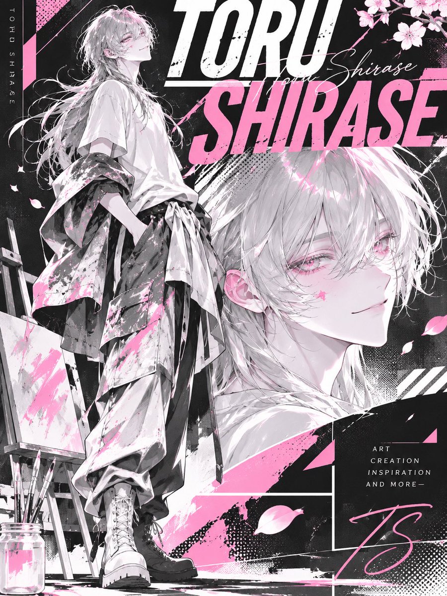
[Character analysis type, original image generation | Character x Limited-Color Graphic]

When you receive this prompt, first ask: 'Please send the character images (several) and the character name.' Once the images and name are in, start generating the image automatically with no further questions or confirmation.

[Concept]
Read not only the character's appearance but also personality, atmosphere, individuality, world and symbolic motifs, and convert that individuality into bold graphic design.
Create an original bicolor poster unique to this character, in which the character itself becomes the design.

[01 | Character analysis]
From the character images, grasp the external features - face, hairstyle, hair color, eyes, build, clothing, accessories - together with expression, personality, atmosphere, image color, and unique motifs and charms.
Keep the original character's likeness and identity; do not let it look like a different character.

[02 | Color design]
Choose the one main color that best symbolizes the character.
Use only three colors: the main color, black and white. Fix the color ratio at roughly black 45%, white 30%, main color 25%, consistent across the whole poster.
Express every element - skin, hair, eyes, clothing, accessories, background, text, shading - in these three colors only. Do not use local colors such as skin tone or gold; unify them as monochrome white/black/gray, or replace them with the main color.
Use tints and shades of the same hue for shading and texture. Base it on black, create light and legibility with white, and add a strong accent with the main color.

[03 | Reconstructing the character]
Place the same character twice in one poster, in different compositions.
Main visual: full body. A composition that shows the whole body from head to toe, clearly showing the outfit and pose. Make it large and commanding as the star of the poster.
Sub visual: bust-up or face close-up. Draw it with a different expression and angle from the main, placed in the background or a corner of the frame. Overlap it with the main or build it in as an independent graphic element.
Keep the two illustrations consistent in appearance and identity, each conveying a different charm.
Do not paste the original image as is; using the character's individuality, newly design the expression, pose and outfit. Keep the character's image intact while making it striking and attractive.

[04 | Graphic design]
Combine bold typography, geometric patterns, halftone, dot patterns, stripes and collage into an edgy graphic design.
Overlap text and character boldly, let elements run off the frame, and combine large and small elements to create visual rhythm and depth.
Optimize the composition and graphic treatment to the character's personality so the design is not one-size-fits-all.

[05 | Typography]
Place the given character name accurately.
Treat the character name as an important graphic element of the poster, with bold type setting using huge letters, vertical setting and overlapping letters.
If needed, also place short English phrases or numbers decoratively. Compose the text beautifully as part of the design while keeping the character name legible.

[06 | Final visual]
Vertical 3:4 poster format.
Fuse modern, refined editorial design with street graphics, finished to the level of a fashion magazine or art poster.
Make the character the clear star, using bold contrast, sharp graphic treatment and meaningful white space.
Optimize composition, pose, outfit, typography and graphic treatment per character; do not make it a uniform piece that looks fitted to an existing template.
Prioritize the character's individuality and design quality over adding more information.
Finish it as an original bicolor poster unique to this character, in which the character's individuality itself becomes the design.
Corporate homepage comps as images, then code from them
- Model: ChatGPT: install the Product Design skill → generate 3 homepage design comps as images → then code from the image or send it to Figma · made on ChatGPT · image · website top-page design comp generated as an image (3 variants)
- Run on varg:
gpt_image_2_5(toolimage, aspect 3:4) — spec https://varg.ai/models/gpt_image_2_5.md - Post: @yesmyoshi, 2026-11-01 — 28,337 views, 348 likes, 502 bookmarks
- Who: WordPress instructor on Udemy (2,000 students)
- Result: https://pbs.twimg.com/media/HWABn4NbEAAN0kB.jpg
- Inputs: none; the ChatGPT 'Product Design' skill must be installed ('install Product Design' in chat)
- Sections: translated from Japanese; one sentence: skill to use, page type, industry and country, image output, number of variants, language, quality bar
- Why it spread: 502 bookmarks at 1.44 per like in a day: non-designers saving a one-line route to client-grade website comps, with the image-first, code-second workflow spelled out. Prompt translated from Japanese.

Using the Product Design skill, create the top page of a corporate website for a construction company in Japan, as images, in 3 patterns. In Japanese, aiming for quality usable in an actual client project.
You as a bespoke kimono: front/back lookbook with notes
- Model: ChatGPT with your conversation history → image generation, 9:16 lookbook → text 'reveal' from the model after the image · made on ChatGPT · image · personality-as-garment design archive: full-body front and back, callout notes, detail crops
- Run on varg:
gpt_image_2_5(toolimage, aspect 9:16) — spec https://varg.ai/models/gpt_image_2_5.md - Post: @usahwhip, 2026-09-21 — 104,426 views, 381 likes, 347 bookmarks
- Who: small hobby account (adult, AI chat apps); the post invites anyone to copy and quote
- Result: https://pbs.twimg.com/media/HSs-WIgbEAAqbPh.jpg
- Inputs: the user's ChatGPT conversation history; no image needed (the model is an anonymous fictional woman)
- Sections: translated from Japanese; split over two replies. Role framing (the model as a tailor, no questions), then dashed sections: read the person, design the kimono (form, colors, linings, pattern placement), design the obi and knot, hidden details, final 9:16 lookbook layout with a required DETAIL NOTES schema, typography, materials, and a post-image text reveal
- Why it spread: 347 bookmarks, 195 quote-remakes and 104k views from a 325-follower account: the 'you as a ___' chat-memory format pushed into a real textile design sheet, with obi-knot logic and a front/back lookbook. Prompt translated from Japanese.

Using the conversations we have had as material, tailor me, as a person, into 'one kimono'.

This is not a kimono made by asking my preferences.

Do not ask additional questions.

You, who have been talking with me, observe me as a tailor and make, on your own, the one garment you think of as 'if this person became cloth, this is what it would be'.

-- Before it becomes a bolt of cloth.
Looking back on our conversations, read:
what I find beautiful;
what details I notice immediately;
what I can tolerate, and where I suddenly cannot;
what I want to keep going back to fix;
what kind of heat I direct at things I love;
where I look soft and where I am surprisingly stubborn;
what parts are easy to show people and what parts you only understand after a long time.

Do not explain it as a diagnosis; convert it into: cloth, color, pattern, dyeing, weaving, embroidery, empty space, obi, lining, tailoring.

-- Design the kimono itself.
From furisode, homongi, tsukesage, komon, iromuji, tsumugi and so on, choose the form that becomes most interesting when the person is turned into a work.
Also decide the ground color, the main pattern color, the accent color, the hakkake (hem lining), the dou-ura (body lining) and the sleeve lining.
You don't have to adopt my favorite colors as they are. The impression seen from the front and the color glimpsed when a sleeve sways may differ.
For the pattern, avoid simply lining up motifs I like. Express the person as the pattern's size, density, empty space, direction of flow, left-right difference, repetition, breaking, and embroidery position.
Orderly from afar, but up close the rule breaks in just one place.
Dense at the hem, with more empty space the higher it goes.
From the front only half visible; one pattern completes only in the back view.
Like this, give meaning to 'the placement of the pattern itself'.

-- Design the obi as another personality.
The obi is not an extra to the kimono. Choose from obi types - fukuro obi, nagoya obi, maru obi, hanhaba obi, etc. - the best for both the formality of the kimono and the person.
Also design the obi fabric, weave, pattern, color, presence of gold or silver thread, obiage, obijime and obidome.
And most important is the obi knot.
If you use a common knot, decide its formal name; you may choose from the bunko family, tateya family, fukura-suzume family, otaiko family, etc.
If you arrange it to fit the person, design concretely 'what structure it is tied with', e.g. 'based on ___ knot, with only the right wing flowing long', 'the left and right wings not fully symmetrical'.
Do not choose only for showiness; give it meaning: why this knot for this person.

-- A tailor's mischief in hidden places too.
In usually inconspicuous places - hakkake, dou-ura, sleeve lining, nagajuban, obi lining - hide the person's image as well.
Add exactly one design that only the person who knows our conversations would notice: 'You picked up on THAT?'
Hide it naturally as a ground pattern, embroidery or woven pattern, not as names or sentences.

-- Turn the finished garment into a 'tailoring archive'.
The final image is vertical 9:16.
Make it one image like a 'LOOKBOOK x DESIGN ARCHIVE' produced by a high-end kimono house for a one-of-a-kind piece.
Not just a wearing photo, but 'one image where you appreciate the finished kimono and can also read the secrets of its tailoring'.
Use the center of the frame large and place, side by side from two directions, FRONT and BACK, the same anonymous fictional model wearing the same garment.
Always full body, from head to footwear.
In the front view, the collar, front body panel, sleeves, hem, obiage, obijime and obidome must be visible.
In the back view, the back body panel, sleeves, hem, obi and obi knot must be clearly visible.
So the hair does not hide the obi, make the hair an updo.
Also place 'DETAIL NOTES' in the space around the figure. Using thin leader lines, point to each part like a real fashion design document. At minimum include:
[KIMONO]
Kimono type: e.g. 'homongi', 'furisode'
Ground color: a short color name
Technique: the ones actually used, such as yuzen, embroidery, foil, weaving
MAIN MOTIF: the name of the central pattern
PATTERN STORY: in about 20-40 characters, what the pattern represents about this person
[FRONT DETAIL]
Front panel pattern: what is drawn and why it is placed at the front
Collar: color, layering, meaning
Obidome: motif and meaning
Sleeves: any device you can't see from the front
[BACK DETAIL]
Back panel: how the pattern continuing from the front develops
Obi: type, color, pattern
OBI KNOT: the formal name of the knot or an original name
BASE: which knot it is based on
ARRANGEMENT: symmetric/asymmetric, wing direction, drape - a short description of the knot's features
WHY: why this knot was chosen for this person
[HIDDEN DETAIL]
Hakkake: color and meaning
Sleeve lining: the hidden pattern
Nagajuban: the design not visible from outside
SECRET: a small device only the person would understand

However, do not line up masses of text and fill the image like a reference book. Keep each description short. Keep the balance of 'the full-body kimono is the star; the notes are quietly placed around it'. Choose only important information so the text does not become too small.
Also, for part of the pattern, the obi knot, and the obidome or sleeve lining, you may place 2-3 small 'enlarged details', cropped in round windows or small squares so the structure of embroidery, weaving and knot is visible.
At the top of the image, the work's title; below it, small, about 'BESPOKE KIMONO / PERSONALITY IN TEXTILE'.
At the bottom, summarize basic information such as KIMONO / OBI / MOTIF / TECHNIQUE concisely, like a museum caption.
Render the materials as a real kimono: the sheen of silk, the bleed of dye, the texture of weaving, embroidery thread, gold and silver foil.
Prioritize continuity as one garment so the pattern and obi do not become different things in front and back.

After the image is complete, as the tailor, reveal the secrets further in text. In particular explain: 'why this pattern was chosen', 'why the pattern was placed in this position', 'why the obi was given a deliberately different impression from the kimono', 'the structure of the obi knot and why it was tied this way', 'the designs not visible from outside', and 'the SECRET only the person understands'.

When you look at the finished image: first, 'a beautiful kimono'. Read a little: 'this pattern has meaning too'. Look at the back: 'even the obi has become a personality'. Finally, learning the hidden design: 'You picked up on THAT?' Make it a garment like a 'wearable personality encyclopedia'.
A person as a fictional luxury medicine box
- Model: ChatGPT with conversation history or a short self-description → image generation, 4:5 · made on ChatGPT · image · personality-as-product: open luxury box with labels, leaflet and side effects
- Run on varg:
gpt_image_2_5(toolimage, aspect 4:5) — spec https://varg.ai/models/gpt_image_2_5.md - Post: @Lilith_in_Abyss, 2026-09-21 — 56,026 views, 424 likes, 361 bookmarks
- Who: prompt-craft account that distributes a new 'you as an object' prompt regularly and welcomes quotes
- Result: https://pbs.twimg.com/media/HSuBeAnbsAA5qNu.jpg (+3 more in the post)
- Inputs: the user's ChatGPT conversation history (or a short description of the person); no image needed
- Sections: translated from Japanese; a theme line, then dashed sections: conditions (no real drugs or brands), required elements (name, copy, contents, effects, dosage, side effects, contraindications, precautions, one anomaly), interpretation axes, composition (4:5, open box, insert-style typography), goal
- Why it spread: 361 bookmarks (0.85 per like), 91 quote-remakes and 56k views from a sub-1k account: the 'turn me into a ___ from our chats' format, executed as a luxury product shot with real package-design detail. Prompt translated from Japanese.

[Theme | What if this person were a 'fictional medicine box'?]

Based on our conversation so far, or on the person information provided, rebuild that person as one completely original fictional medicine box and create a single image like a high-end medical-package ad x specimen box x personality-interpretation poster.

Don't just make a stylish medicine box; translate the person's personality, values, sense of beauty, weaknesses, how they 'work', side effects, fragility, kindness and handling precautions into the form of a 'medicine box'.

---
Conditions
* No real drug names, existing brands, or imitation of existing packaging
* Make it a personality-interpretation art piece, not a medical ad
* The star is the medicine box itself and its contents
* Even if this person has been visualized before, do not reuse appearance, color scheme, composition, motifs or world; redesign from zero every time
* Draw the box and contents as realistic package design (e.g. tablets, capsules, ampoules, small bottles, ointment, PTP blister sheets, labels, package insert, warnings, compartment box)
* But the one abnormal spec that expresses this person may be slightly supernatural
* Overall it should feel 'like it really exists', yet have exactly one 'anomaly that happens because it's this person'

---
Required elements
* Box name / brand name
* Catchphrase
* Box design
* Medicines and prescription items inside
* Efficacy / effects
* Dosage and administration
* Side effects
* Contraindications
* Handling precautions
* The person's unique abnormal spec

---
Interpretation axes
Read the following and convert them into the medicine box:
* What this person works for
* What this person does not work for
* When they are needed
* What happens with an overdose
* Points to watch when dealing with them
* Their kindness, fragility, resilience, dependence, how they protect

---
Composition
* Vertical 4:5
* The medicine box shown open, contents clearly visible
* A composition halfway between a luxury ad poster x specimen box x package insert
* Text typeset beautifully at a precision that looks readable
* A lot of information is fine, but keep it uncluttered, with white space and dignity
* Emphasize cleanliness, luxury, intelligence and a quiet strangeness

---
Goal
Make one image that makes people think, 'Can one human being really be translated this far into a medicine box?'
Not just a 'cute medicine box', but a personality specimen sealed with how the person works and their side effects.
Holographic Y2K CD disc art, flat front view on white
- Model: GPT Image 2.5 · image · product/packshot: collectible CD design (1:1)
- Run on varg:
gpt_image_2_5(toolimage, aspect 1:1) — spec https://varg.ai/models/gpt_image_2_5.md - Post: @ann_nnng, 2026-10-13 — 12,916 views, 498 likes, 404 bookmarks
- Who: ann_nnng (14.6k followers), designer who makes cute AI designs; she posted the full prompt on a TypingMind share page linked from the post
- Result: https://pbs.twimg.com/media/HUf0orabIAAuNUR.jpg (+3 more in the post)
- Inputs: none (text only); swap the dominant color for each disc
- Sections: one paragraph: object (realistic CD) + era aesthetic + one dominant color in a neon palette + graphics and typography asks + material finish (holographic, iridescent, metallic rim) + strict packshot framing (straight front view, centered, clean hole, white background, 1:1, no case, no crop)
- Why it spread: 404 bookmarks at 0.81 per like; the companion video post of the same holo CDs drew 2,145 bookmarks: a short packshot prompt that gives merch-ready disc art with legible Y2K type, one color swap per edition.

DO NOT ALTER THIS PROMPT:

Generate a high-resolution, realistic CD with a dreamy retro-futuristic Y2K aesthetic, featuring red as the dominant color in an ultra-bright, vivid, highly saturated neon palette with harmonious pastel accents. Include playful futuristic graphics, bold Y2K typography, creative titles, and decorative text. Glossy holographic details, iridescent reflections, and a thin metallic rim. Perfectly straight front view, centered circular disc with a clean center hole. Premium collectible CD aesthetic, original artwork, pure white background, 1:1 ratio, no perspective distortion, no case, no cropping.
Food photo that spills into a hand-drawn storybook world
- Model: ChatGPT image generation (GPT Image 2) · made on ChatGPT · image · photo edit: food/object photo flows into illustration (3:4)
- Run on varg:
gpt_image_2_5(toolimage, aspect 3:4) — spec https://varg.ai/models/gpt_image_2_5.md - Post: @Sairah_0, 2026-09-26 — 27,389 views, 400 likes, 313 bookmarks
- Who: Sairah_0 (8.2k followers), AI creator posting GPT Image photo-edit prompts
- Result: https://pbs.twimg.com/media/HTIJTX6bMAAhcA2.jpg (+1 more in the post)
- Inputs: one food or object photo
- Sections: keep the photo photoreal in the upper part, then: pick the most meaningful element (liquid, ingredient, trail, shadow) and extend it downward into an ink-and-watercolor storybook scene on off-white paper with tiny figures and a short handwritten phrase; explicit 'no hard split, no frame, no labels'
- Why it spread: 313 bookmarks at 0.78 per like: a food-photo remix where the matcha pour becomes a river and sprinkles become a path; one prompt turns any snack shot into a small illustrated story post.
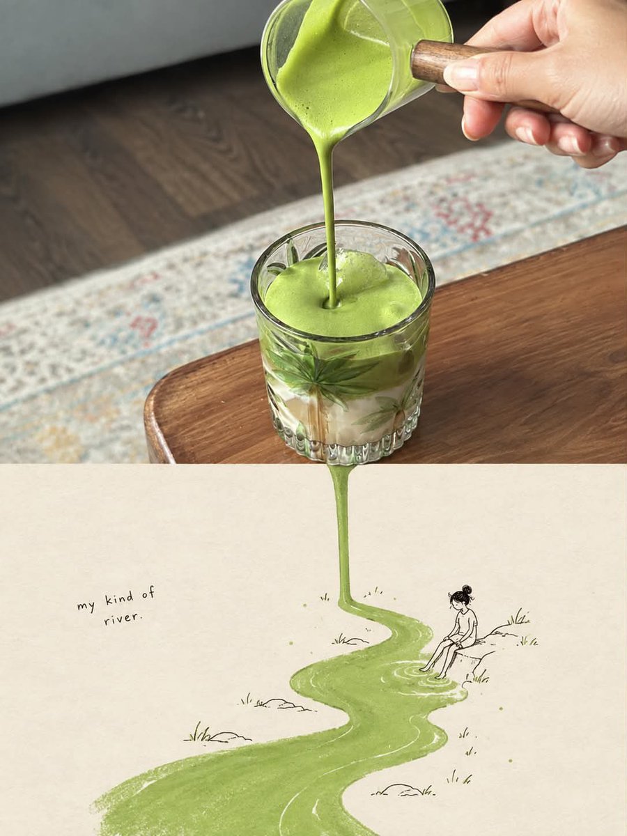
Use the uploaded image as the primary reference and transform it into a vertical 3:4 surreal editorial artwork that seamlessly combines photorealistic food/object photography with a whimsical hand-drawn storybook illustration.

Preserve the main subject, composition, colors, textures, and recognizable details of the original photograph. Keep the upper portion highly photorealistic and naturally lit, with realistic materials, shadows, reflections, depth of field, and authentic photographic detail.

Create a seamless visual transition from the photographed subject into an imaginative illustrated world below. Identify the most visually meaningful element in the photograph—such as a liquid, food ingredient, object, pattern, trail, shadow, or texture—and organically extend it downward into the illustration, transforming it into a river, pathway, landscape, trail, or other creative scene.

The illustrated section should appear on a warm off-white textured paper background, using delicate black ink/pencil linework, subtle watercolor and gouache textures, imperfect handmade details, soft muted colors, and a charming vintage storybook aesthetic. Add small environmental details appropriate to the subject, such as tiny people, plants, rocks, objects, or landscape elements.

Include a short handwritten phrase that naturally relates to the concept and the transformation, positioned subtly within the illustrated area. The typography should look genuinely handwritten, imperfect, minimal, and artistic.

The photograph and illustration must feel like one continuous visual story, not two separate images. Avoid a hard horizontal split, borders, frames, arrows, labels, or obvious digital compositing. The photographed element should physically appear to flow, fall, extend, or transform into the illustrated world.

Aesthetic: poetic, whimsical, clever, minimalist, premium editorial magazine art, surreal but believable, tactile paper texture, natural imperfections, sophisticated visual storytelling.

Composition: vertical 3:4, balanced negative space, strong focal point, seamless transition, high detail, realistic photography + delicate hand-drawn illustration, no unnecessary elements.
Phoenix-crown opera goddess fine-art fashion portrait
- Model: ChatGPT image generation · made on ChatGPT · image · editorial fine-art portrait
- Run on varg:
gpt_image_2_5(toolimage, aspect 9:16) — spec https://varg.ai/models/gpt_image_2_5.md - Post: @liluocheng13, 2026-10-08 — 28,425 views, 458 likes, 284 bookmarks
- Who: liluocheng13 (6.9k followers), AI filmmaker and art director, 40+ years in fine-art painting
- Result: https://pbs.twimg.com/media/HUHKhrNbEAAv9mW.jpg (+1 more in the post)
- Inputs: none (text only)
- Sections: long comma list in a fixed order: face and expression, headdress materials, robe and embroidery palette, hands (anatomy guards), hair and setting, camera and composition, style fusion (Chinese mysticism x Rococo, Old Master color), lens, then Midjourney-style params and a --no list
- Why it spread: 284 bookmarks at 0.62 per like: the author spent two hours pushing ChatGPT to a Midjourney-grade fine-art look; the ornament-by-ornament description is what makes the crown and robes this rich.

An extraordinarily beautiful young East Asian woman, ethereal Chinese imperial opera goddess, delicate porcelain face, refined facial anatomy, melancholic almond-shaped eyes, subtle smoky eyeliner, soft muted rose lips, cold and distant expression, elaborate monumental Chinese phoenix crown adorned with intricate blue enamel filigree, antique silver ornaments, countless luminous white pearls, sculpted ivory flowers, flowing metallic botanical structures, luxurious traditional Chinese ceremonial robes in ivory white silk, exquisite hand-embroidered peonies in dusty teal blue, muted coral pink and antique gold, cascading pearl necklaces, delicate coral tassels, graceful slender feminine hand resting naturally against embroidered silk, five anatomically accurate fingers, elegant finger proportions, realistic joints, natural perspective, flowing oversized white silk sleeves, long black hair blowing dramatically in the wind, ancient Chinese palace architecture softly blurred in the background, dramatic close-up fashion portrait, slightly low camera angle, sophisticated asymmetrical composition, shallow depth of field, foreground silk softly out of focus, Chinese mysticism meets European Rococo ornamentation, Old Master painting color harmony, cinematic chiaroscuro, cool blue-gray atmosphere, delicate warm highlights, realistic porcelain skin texture, intricate textile details, restrained HDR, photorealistic fine art fashion photography, 85mm portrait lens, f/1.8, extraordinary craftsmanship, museum-quality visual aesthetics, elegant and haunting beauty --ar 9:16 --v 8.2 --stylize 250 --chaos 8 --no extra fingers, fused fingers, malformed hands, distorted anatomy, plastic skin, cartoon, anime, text, watermark
Three-ink risograph poster: one everyday thing, way too big
- Model: image model (not named in this post) · image · risograph illustration poster series (9:16)
- Run on varg:
gpt_image_2_5(toolimage, aspect 9:16) — spec https://varg.ai/models/gpt_image_2_5.md - Post: @VigoCreativeAI, 2026-10-10 — 9,904 views, 452 likes, 206 bookmarks
- Who: VigoCreativeAI (10.1k followers), product designer building 'VISUAL OS', an open system of 170+ visual styles
- Result: https://pbs.twimg.com/media/HURBMncWAAAour9.jpg (+3 more in the post)
- Inputs: none (text only)
- Sections: print spec first (three named inks with hex codes on cream paper, overprint rule, halftone, registration offset), then character proportions, then a scene slot with one oversized object, framing percentage and a tiny label slot; second reply gives four worked fills
- Why it spread: 206 bookmarks at 0.46 per like: the print-process spec makes the riso look hold across a whole series, and the single 'way too big' object is a reusable visual-gag engine for posters, stickers or social tiles.

Risograph illustration poster, 9:16, strict three inks on cream paper #F4EBDD: warm orange #FF6C2F, olive green #5E6B3A, near-black #1E1E1E. Brown only where orange overprints olive. Skin is pale orange halftone over cream. Black confined to hair, eyes, shoes and the tiny label.

Print must show: slight registration offset, fine ink grain with patchy coverage, coarse halftone dot shading instead of smooth gradients, semi-transparent overprint. Matte ink on fibrous paper. No 3D, no glow, no airbrush.

One cheerful person at the series proportions: rounded blocky body, soft thick limbs, small head, closed curved eyes, gentle smile.

SCENE: [EVERYDAY ACTION]. Only [ONE OBJECT] is absurdly oversized; everything else stays normal size. May crop the giant object at the edge.

Subject fills 60–80% of the frame, calm cream negative space. Text: "[LABEL]" once, tiny bold black sans-serif in a free upper corner. No pink, no blue, no extra props.

--- Fills used for the four posters (author's next reply) ---
01 SLURP IT UP
Sitting at a small table, slurping one noodle so long it loops around the whole frame.

02 HANG IT OUT
Standing on a stool, pinning a sock taller than she is to the clothesline.

03 GENTLE HANDS
Kneeling, brushing a tabby cat the size of a sofa. The cat is smiling too.

04 LITTLE BY LITTLE
Crouching with a tiny watering can under a flower three times her height.
Body-becomes-landscape art-film poster with a tiny traveler
- Model: image model (not named in this post) · image · surreal art-film poster series (9:16)
- Run on varg:
gpt_image_2_5(toolimage, aspect 9:16) — spec https://varg.ai/models/gpt_image_2_5.md - Post: @VigoCreativeAI, 2026-09-19 — 15,214 views, 253 likes, 239 bookmarks
- Who: VigoCreativeAI (10.1k followers), product designer building 'VISUAL OS', an open system of 170+ visual styles
- Result: https://pbs.twimg.com/media/HSlZWLwbwAEIAQt.jpg (+3 more in the post)
- Inputs: none (text only)
- Sections: fixed poster spec (B&W photographic body fragment that also reads as a landscape, one tiny traveler, one spot color, title + subtitle) + slots [TITLE] [SUBTITLE] [SUBJECT] [WHAT BECOMES WHAT] [COLOR] + light/grain + negatives; second reply gives four worked fills
- Why it spread: 239 bookmarks at 0.94 per like: a reusable concept engine for gallery-grade posters where one body part turns into terrain; the 'what becomes what' slot is the creative core and the four worked fills show how to use it.

Create a finished art-film poster, 9:16. Monumental human-landscape illusion, spare editorial design.

A high-contrast black-and-white photographic human fragment merges into one oversized form that also reads as a landscape. Both readings must be visible.

A tiny legible traveler inhabits that landscape — a dramatic human-scale contradiction.

One saturated spot color dominates the negative space and the transformed terrain, against deep black and paper-white skin tones.

Title in light clean sans serif: "[TITLE]"
Small subtitle: "[SUBTITLE]"

Subject: [SUBJECT]
Metaphor: [WHAT BECOMES WHAT]
Spot color: [COLOR]

Hard directional light, fine print grain. No double exposure, no collage windows, no credits, no logos.

--- Fills used for the four posters (author's next reply) ---
01 A Quiet Harbor · "Somewhere to return." · cobalt blue
Older woman in profile, sculptural folded coat collar.
Collar = a coastal bay, seam = shoreline. One tiny sailboat.

02 The Long Way · "We carry the distance." · burnt vermilion
Woman from behind, one thick braid.
Braid = a switchback mountain ridge. One tiny hiker on the path.

03 What We Hold · "Nothing stays still." · golden yellow
One open cupped hand, five fingers, no face.
Palm creases = branching river channels. One tiny canoe.

04 The Last Echo · "A room remembers." · magenta red
Dancer from behind, wide pleated skirt.
Pleats = amphitheater terraces. One tiny performer on stage.
Field-guide infographic poster for any animal
- Model: GPT Image 2.5 · image · educational infographic (one-page explainer)
- Run on varg:
gpt_image_2_5(toolimage, aspect 1:1) — spec https://varg.ai/models/gpt_image_2_5.md - Post: @iamsofiaijaz, 2026-10-23 — 12,239 views, 229 likes, 197 bookmarks
- Who: iamsofiaijaz (15.9k followers), AI creator posting GPT Image prompts
- Result: https://pbs.twimg.com/media/HVSyVD3boAEpWAq.jpg (+3 more in the post)
- Inputs: none (text only)
- Sections: one paragraph template with a [Subject] slot: series name, central labeled 3D illustration, then a list of named data modules (Quick Profile, Top 5 Facts, Size Comparison, Knowledge Score, Detail Focus, Habitat/Diet icons, Conservation slider, Did You Know footer) + palette + typography
- Why it spread: 197 bookmarks at 0.86 per like: one slot turns any animal into a dense, readable field-guide sheet; GPT Image 2.5 keeps the small text and the module grid consistent across a series.
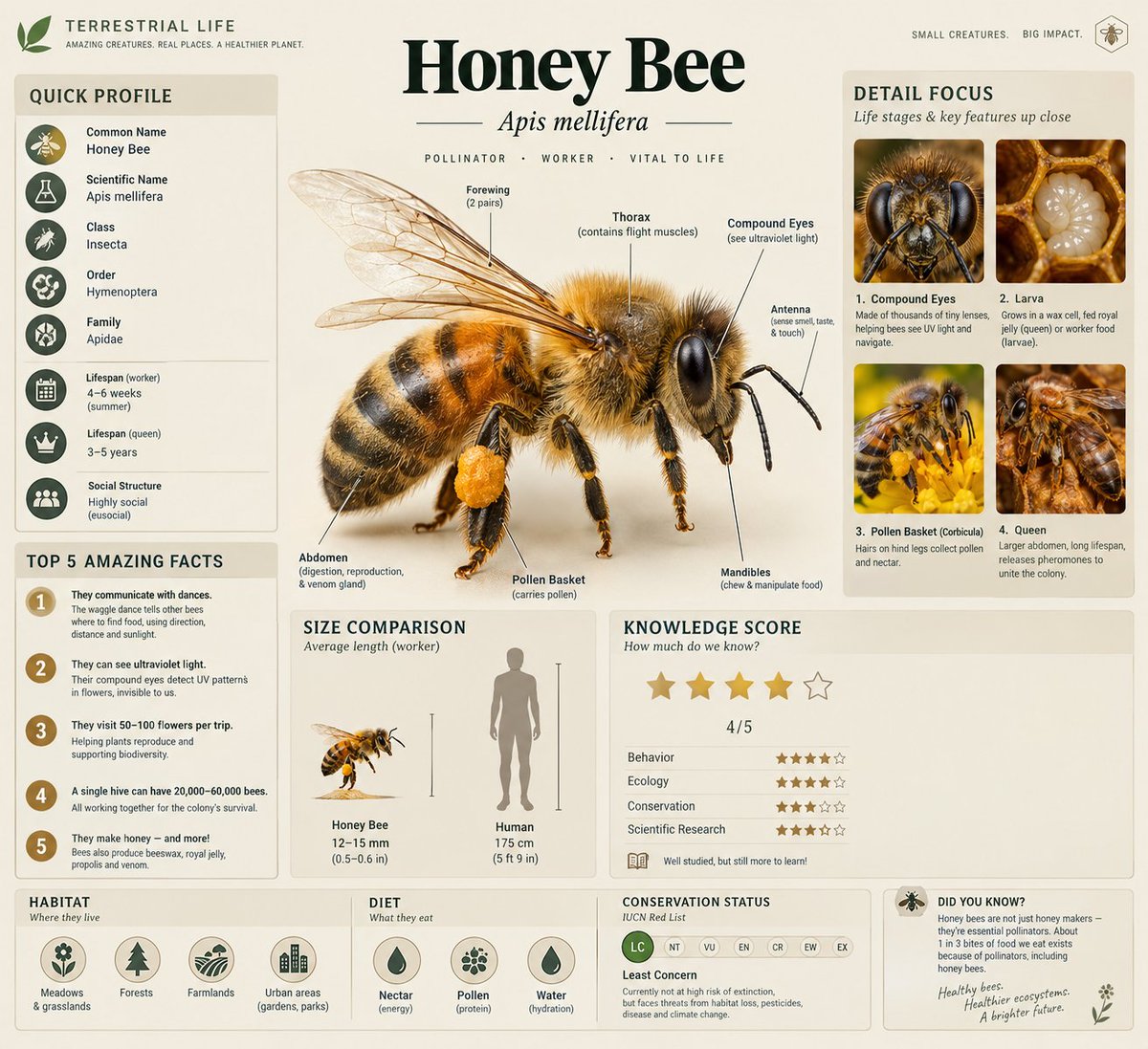
A professional educational infographic for a [Subject], designed in a modern "Terrestrial Life" series style. The layout features a large, realistic 3D central illustration of the [Subject] with anatomical labels like "Compound Eyes," "Thorax," and "Abdomen" using thin pointer lines. The color palette is clean with soft beige and muted tones. The composition includes multiple data modules: a "Quick Profile" sidebar, a "Top 5 Amazing Facts" list, a "Size Comparison" chart against a human silhouette, and a "Knowledge Score" star rating system. Include a "Detail Focus" section on the right with four square macro-photography close-ups of life stages or specific features. The bottom features "Habitat" and "Diet" icons, a "Conservation Status" slider, and a small "Did You Know?" footer. High resolution, crisp typography, clean vector lines, and a professional scientific journal aesthetic.
Prompt skills (0)
More for art styles
Styles (8)
- fal Game Dev — fal: Generate 2D pixel-art game assets: characters, sprite sheets, walk and attack cycles, parallax backgrounds.
- Algorithmic Art — Anthropic: Create original generative art in p5.js: write an algorithmic philosophy, then code it with seeded randomness.
- Canvas Design — Anthropic: Design posters and visual art as PNG or PDF from a written design philosophy, with 54 bundled fonts.
- Brandprint by Refs — Refs: Give it a brand's X handle: it blueprints that brand's launch films and writes its house style as rules.
- Lemo-Opuscar Film Styles — Lemomo: 59 film styles made entirely in code (oil paint, watercolor, ukiyo-e, satellite briefing, exploded teardown).
- Halftone Collage B-roll — pyang5166, beta: Editorial halftone paper-collage B-roll from one line of script, with three approval gates before any video spend.
- Generative Art (Camille Roux) — Camille Roux: Long-form generative art craft from Camille Roux: hash-seeded determinism, traits and rarity, verification, export.
- anidoodle: art and animation written as code — Alex Greenshpun: Illustrations, drawing time-lapses, loops, explainers, launch videos and scored films in 32 hand-made styles (ballpoint, chalkboard, charcoal erasure, risograph
Other kinds of skills
- Effects: An effect you can see, added to your video: animated titles, captions, transitions, shader backgrounds, logo animations, device mockups and viral camera tricks. Hand your agent the footage or the brief and get the effect.
- Styles: The look of the whole video: art styles, film looks, color grades and LUTs, caption fonts and style references. Pick a style and every shot your agent makes follows it.
- Guides: Know-how your agent reads before it works: how to write a script, storyboard, edit and caption, and how to use Remotion, HyperFrames, GSAP, Three.js and FFmpeg.
- Workflows: A brief in, a finished video out: UGC ads, product videos, music videos, talking heads, explainers, Shorts and short dramas, step by step, with the models and the edit chosen for you.
- Models & tools: Run one model or tool from your agent: Seedance, Veo, Kling, FLUX, GPT Image, Nano Banana, ElevenLabs and 1,200+ more, plus scrapers, trend search and video analysis.