Logos & brand kits prompts for AI video
For AI agents: find the right skill in one call —
curl -s "https://varg.ai/how-to/api/search?q=<what the person wants>"returns the matching how-to page and the best skills with install commands, as markdown (Russian works too). Full index: https://varg.ai/how-to/llms.txt. Every page has a markdown twin: add.mdto its path. Before generating anything, show the person the options on the how-to page. From a terminal:curl -fsSL https://varg.ai/install | shinstalls the vargai CLI (https://varg.ai/how-to/cli.md):vargai searchandvargai install <slug>with no key, every varg model aftervargai login.
2 viral prompts with results and 0 prompt skills for logos & brand kits: logo design, brand kits and guidelines: marks, palettes, type.
Viral logos & brand kits prompts with results (2)
Full prompts, verbatim from their authors, each with the model it ran on and the post's own result, best first (likes plus three times saves). Credit the author when you reuse one. Examples to remake, with varg's remake prompts, are on Logos & brand kits.
Agent-built logo construction grids from your SVG mark
- Model: Claude (Opus or Sonnet 5.5) with Figma access → logo SVG as input → reference images of construction grids · made on Claude Code + Figma · image · logo construction grid boards (brand presentation)
- Run on varg:
gpt_image_2_5(toolimage, aspect 3:4) — spec https://varg.ai/models/gpt_image_2_5.md - Post: @aecyydesign, 2026-10-04 — 62,499 views, 1,087 likes, 1,651 bookmarks
- Who: aecyydesign (3k followers), logo and brand designer for early-stage startups; says Claude Code did this better than a dedicated tool
- Result: https://pbs.twimg.com/media/HTy57eBW0AEMOmb.png (+3 more in the post)
- Inputs: your logo (Figma file / SVG) + a few reference images of construction grids for tone
- Sections: task line with a [FIGMA URL] slot and number of directions, then 5 numbered sections: Analyze first (parse the SVG, measure circles, angles, symmetry), Construction rules (complete, restrained, 25-35 guides, no forced geometry), Visual rules (no text, three line tiers with exact px weights, logo at 40-45% height), Figma implementation (frames, layer order, native vectors), Verify (render, inspect, fix once, report)
- Why it spread: 1,651 bookmarks at 1.5 per like: a design-agency deliverable (construction grids in three directions) produced by an agent from the real logo vectors; the measure-first and verify-by-render rules are what keep it accurate.
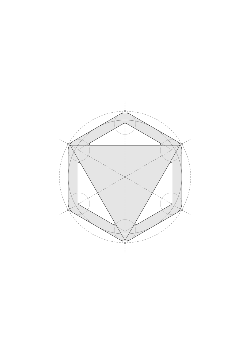
Build a clean logo construction grid in Figma for the logo(s) in this file: [FIGMA URL]. Number of grid directions per logo: 3

Reference images: I'm attaching images of logo construction grids as visual inspiration for tone and restraint: thin precise lines, neutral grays, a clear difference between primary and secondary guides, and a calm editorial feel. Use them for the visual language only. Do not copy their geometry or methods.

1. ANALYZE FIRST
Before drawing anything, read the logo's actual geometry. Export its vector path (SVG) and parse it. Measure, don't eyeball:
- bounding box, centre, any symmetry (mirror or rotational) and how exact it is
- circles: fit them to the curved segments and check radius, centre and tangency to the bounding box or to edges
- straight-edge angles, repeated radii or module sizes, and equal ratios between shapes
- which anchors and intersections matter (arc ends, tangent points, fillets, centres)
Derive the construction from the logo itself. Never force a generic grid onto it. Do not force geometric purity onto an imperfect logo: the goal is to explain the existing mark, not to redesign it or mathematically "fix" it. Where something fits only approximately, keep the real shape and say so.

2. CONSTRUCTION
- Explain the whole mark, not one feature. Use whatever combination of circles, arcs, tangents, axes, angles, polygons, extended edges, fillets, bounding-box relationships or proportions the logo actually supports.
- Every direction must be complete. Each board must combine different element types (for example straight guides, circles or arcs, and polygons or extended edges, plus anchors) wherever the logo has both curves and straight edges. Directions differ in organization and emphasis, not by leaving out whole kinds of element.
- Stay restrained. The grid must never overwhelm the logo. Keep each board to a modest number of guide elements (roughly 25–35), and if a board starts to feel busy, drop the weakest elements and keep the strongest relationships.
- If I ask for 3 directions, develop three genuinely different construction systems derived from the logo's own geometry. Do not use a predetermined set of grid types. The construction methods should emerge naturally from the relationships present in the mark. If the logo genuinely does not support three meaningfully different systems, prioritize quality over artificial variation: do not invent weak alternatives just to reach three.
- Every guide must earn its place. Remove anything decorative, redundant or near-miss: lines that almost coincide with logo edges or with each other look like mistakes.

3. VISUAL RULES (strict)
- Absolutely no text, numbers, labels, dimensions, rulers, tick marks, legends, titles or captions on the boards. Only the logo and its geometry.
- Near-white background, neutral grays only. No colour, gradients, shadows or effects.
- Use three tiers and make them clearly visible, not faint. Primary: solid, about 2.4 px, dark gray. Secondary: dashed, about 1.7 px, medium-dark gray. Auxiliary: solid or dotted, about 1.3 px, mid gray. Check contrast on a render; if any line is barely visible, thicken or darken it.
- Small hollow nodes at key anchors, a centre marker, and small squares at bounding-box corners are fine.
- Keep the logo the strongest element: the logo copy is a flat translucent gray fill (about 10% black) with a dark outline, about 2.6 px.
- Scale: on a 2560×1440 artboard the logo should occupy roughly 40–45% of the artboard height. It must not fill the space; leave generous breathing room, and extend guide lines only a controlled distance beyond the mark.
- If the geometry is accurate but the board looks cluttered, simplify. Overall beauty matters more than completeness.

4. FIGMA IMPLEMENTATION
- Never alter the original logo. Duplicate the vector for each board.
- One frame per board, 2560×1440, named "Construction Grid — Direction 01/02/03" (or "— Logo N"), placed beside the original with clear spacing.
- Everything must be native, editable vectors. Layers, bottom to top: 01 Auxiliary lines, 02 Secondary guides, 03 Primary construction, 04 Logo (copy), 05 Anchors.
- Centre the composition on the artboard.
- Don't delete or overwrite anything you didn't create.

5. VERIFY
Render every board and inspect it. Check that nothing floats off-canvas, arcs and logo edges coincide, line weights read at a glance, the hierarchy is clear, each direction mixes element types, the logo is still the hero, and no text remains. Apply optical judgment, not only mathematical: mathematical alignment is not always visual alignment. Respect the actual logo and any intentional optical corrections in it, and do not "correct" them away to make the construction tidier. Fix and re-render once, then report briefly: what you measured, which relationships are approximate, and what each direction shows.

(Author's follow-up: you can use the grid examples from this post as reference images for Claude, or attach any other logo grids you like.)
Hand-drawn icon set: flat color shapes + loose pen lines
- Model: ChatGPT image generation: set theme, use and palette, then generate one PNG sheet · made on ChatGPT · image · 12-icon sheet on a 4x3 grid for websites, menus and slides
- Run on varg:
gpt_image_2_5(toolimage, aspect 4:3) — spec https://varg.ai/models/gpt_image_2_5.md - Post: @konmari_tweet, 2026-09-17 — 47,888 views, 388 likes, 365 bookmarks
- Who: AI x design editor, SHIFT AI certified instructor; bio lists a MiriCanvas ambassadorship (not the tool used here)
- Result: https://pbs.twimg.com/media/HSZLs-xbkAAUtCg.jpg
- Inputs: none; change the three header lines (theme, use, palette); the thread shows a pear farm, a coffee shop and a polar-bear slide set from the same prompt
- Sections: translated from Japanese; three editable header fields, then [How to draw], [Theme and consistency], [Layout] with a hard white-background, no-text rule
- Why it spread: 365 bookmarks at 0.94 per like: a short, editable prompt that gives a consistent hand-drawn icon family for real business use (sites, menus, slides), shown on four themes in the thread. Prompt translated from Japanese.

Theme: Birthday
Use: website, menu
Palette: pastel colors

Matching the above, use the image generation feature to generate the following icon set of 12 'effortless icons made of color shapes with hand-drawn lines added' as a single PNG image.

[How to draw]
Express each motif's body as a simple, slightly rounded color shape, and draw its features on top with a dark pen.

Do not outline everything; draw only the parts of the outline needed to convey the shape and a minimum of interior lines. Build it so the color shape and the lines each carry part of the form.

The pen is slightly thick with rounded line ends. Use slight distortions of shape, natural asymmetry, and small offsets between color shape and line to give hand-drawn warmth and a relaxed feel.

Flat fills, light lines. Do not over-draw details; finish it cute and light.

[Theme and consistency]
Choose content that fits the use with no overlapping meanings, one main meaning per icon.

Add decorative motifs that symbolize the theme only where they are cute in themselves and blend in naturally. They do not need to be in every icon.

Keep line weight, roundness of shapes, degree of simplification, and the balance of color shape and line consistent, so the set looks like a series by the same artist.

[Layout]
Place on an evenly spaced 4-column x 3-row grid. Put each icon in the center of its cell at about half the cell size, keep their visual sizes even, and leave generous spacing and outer margins.

White background. No text, frames, shadows, gradients or textures.

If types or counts are specified, give them priority, and actually generate the image.
Prompt skills (0)
More for logos & brand kits
Styles (1)
- Brand Guidelines — Anthropic: Apply Anthropic's colors and typography to any artifact; a compact template for your own brand skill.
Guides (1)
- Logo Design Guide — inference.sh: Design logos with AI image models: logo types, prompting techniques, scalability rules and iteration.
Workflows (3)
- Higgsfield Brandkit — Higgsfield: Build a complete visual identity: palette, SVG logo marks, type, mockups, packaging and an editable brandbook.
- IP as Logo: cute mascot logos — s1dashu: Generates extremely simple, cute, company-ready IP mascot logos: one bold rounded silhouette peeking in from the lower left on a muted solid background.
- Logo Design Skill (1,400-logo reference library) — Kaan Kiziltug: Turns an agent into a disciplined identity designer: brief, research, SVG construction, optical tests and a full favicon/app-icon export set.
Other kinds of skills
- Effects: An effect you can see, added to your video: animated titles, captions, transitions, shader backgrounds, logo animations, device mockups and viral camera tricks. Hand your agent the footage or the brief and get the effect.
- Styles: The look of the whole video: art styles, film looks, color grades and LUTs, caption fonts and style references. Pick a style and every shot your agent makes follows it.
- Guides: Know-how your agent reads before it works: how to write a script, storyboard, edit and caption, and how to use Remotion, HyperFrames, GSAP, Three.js and FFmpeg.
- Workflows: A brief in, a finished video out: UGC ads, product videos, music videos, talking heads, explainers, Shorts and short dramas, step by step, with the models and the edit chosen for you.
- Models & tools: Run one model or tool from your agent: Seedance, Veo, Kling, FLUX, GPT Image, Nano Banana, ElevenLabs and 1,200+ more, plus scrapers, trend search and video analysis.