Style references prompts for AI video
For AI agents: find the right skill in one call —
curl -s "https://varg.ai/how-to/api/search?q=<what the person wants>"returns the matching how-to page and the best skills with install commands, as markdown (Russian works too). Full index: https://varg.ai/how-to/llms.txt. Every page has a markdown twin: add.mdto its path. Before generating anything, show the person the options on the how-to page. From a terminal:curl -fsSL https://varg.ai/install | shinstalls the vargai CLI (https://varg.ai/how-to/cli.md):vargai searchandvargai install <slug>with no key, every varg model aftervargai login.
10 viral prompts with results and 0 prompt skills for style references: mood boards and references from film stills, Pinterest and Are.na, turned into prompts.
Viral style references prompts with results (10)
Full prompts, verbatim from their authors, each with the model it ran on and the post's own result, best first (likes plus three times saves). Credit the author when you reuse one. Examples to remake, with varg's remake prompts, are on Style references.
Eyeless anime silhouette poster in flat paper-cut shapes
- Model: character reference image → image model with reference input · made on not stated · image · character restyle: flat two-to-three-tone silhouette on a dark ground
- Run on varg:
gpt_image_2_5(toolimage, aspect 1:1) — spec https://varg.ai/models/gpt_image_2_5.md - Post: @miomm0766, 2026-10-30 — 251,912 views, 6,616 likes, 3,563 bookmarks
- Who: Chinese hobbyist (AI and fintech), 7.6k followers; the prompt is in the author's own reply
- Result: https://pbs.twimg.com/media/HV5YZuiaoAAbKyb.jpg (+3 more in the post)
- Inputs: any character reference image; the author notes (translated from Chinese) that pose, colors and clothing adapt to the character
- Sections: prompt is in English as posted (post and note in Chinese); six short paragraphs: goal, identity to keep, eyes hidden by hair, hair simplification, graphic style (paper-cut, vector, geometric shadows, negative space), palette and background, then a no-list
- Why it spread: 3,563 bookmarks and 252k views in three days: a short, model-agnostic restyle prompt whose one strong idea (no eyes, flat paper-cut shapes, dark ground) turns any character into a poster-grade graphic.

Create a highly stylized Japanese anime silhouette illustration based on the provided character reference.

Faithfully preserve the character's recognizable features, including hairstyle, hair color, signature accessories, clothing, and any distinctive physical traits. Adapt the pose to suit the character's personality and overall design.

The eyes are completely hidden by the hair. Keep the visible face clean and flat, with no visible eyes, eyelashes, eyebrows, or eye shadows. Express emotion through the character's pose, head angle, and silhouette.

Simplify the hair into smooth, flowing shapes with a moderate number of layered locks. Keep enough detail to preserve the original hairstyle while avoiding tangled strands, excessive curls, tiny wisps, and messy flyaways.

Use a minimalist Japanese graphic poster style, combining anime silhouette art, paper-cut aesthetics, and clean vector-like rendering. Construct the image with large solid color shapes, crisp edges, sharp geometric shadows, minimal outlines, and expressive negative space.

Preserve the character's original color palette and use strong tonal contrast. Simplify clothing and accessories into clean geometric forms while retaining their most recognizable details. Use a solid dark background to emphasize the silhouette.

No visible eyes, eye shadows, realistic textures, soft gradients, painterly shading, 3D rendering, excessive linework, cluttered hair, unwanted character features, or unnecessary details.
Oversized-shape editorial poster series with a fixed palette
- Model: ChatGPT image generation · made on ChatGPT · image · editorial illustration poster series (9:16)
- Run on varg:
gpt_image_2_5(toolimage, aspect 9:16) — spec https://varg.ai/models/gpt_image_2_5.md - Post: @VigoCreativeAI, 2026-10-01 — 194,302 views, 1,699 likes, 1,624 bookmarks
- Who: VigoCreativeAI (10.1k followers), product designer building 'VISUAL OS', an open system of 170+ visual styles; the author confirmed in a reply the images were made in ChatGPT
- Result: https://pbs.twimg.com/media/HTjAP5CasAATZ8-.jpg (+3 more in the post)
- Inputs: none (text only)
- Sections: fixed style block (paper, flat geometric shapes, airbrush shading, grain) + character construction rules + hex palette + caption rule, then four [SLOTS] (caption, character & object, gesture & emotion, shape idea) and a negatives line; a second reply gives four filled examples
- Why it spread: 1,624 bookmarks and 194k views: a style system rather than a single prompt; the hex palette, shape rules and four slots make every new poster look like part of the same designed series.

Create a finished editorial character poster, 9:16, edge-to-edge warm off-white paper. Flat geometric illustration, exaggerated asymmetric proportions, soft airbrushed shading, fine print grain.

One adult character built from a few oversized, asymmetric shapes: small head, long capsule limbs, simple mitten hands. One large object is part of the pose and changes the silhouette. Black cut-paper facial features: crescent eyes, minimal mouth. The emotion reads from the whole-body gesture.

Palette: off-white #F3F1EB, near-black #10100F, hot pink #F553D2, warm red #F42726, cobalt #293EA1, emerald #13785D. Flat color blocks with crisp edges; soft dark-to-color spray gradients where shapes overlap. Fine stipple grain sits mostly inside the ink areas, barely visible on the paper.

One short caption in small bold black uppercase sans-serif, set in an open paper pocket. Not a headline.

Caption: "[MAIN_TEXT]"
Character & Object: [WHO + THE OVERSIZED THING]
Gesture & Emotion: [POSE + FEELING]
Shape Idea: [HOW BODY AND OBJECT FORM THE SILHOUETTE]

No extra text, no logos, no outlined cartoon look, no glossy 3D, no realistic skin, no coarse canvas texture, no busy background, no extra limbs.

--- Fills used for the four posters (author's next reply) ---
01 MAKE IT RISE · dough ribbon · emerald bowl
Smiling baker in a cobalt apron, huge pink hands pulling one pale dough strip into a deep U over the bowl.
Shape idea: the cream dough becomes the main white form between the hands and bowl.

02 FIND YOUR PACE · open wheel circles · steady ride
Cyclist in an oversized pink windbreaker hunched over a thin cobalt bike, two big black ring wheels below.
Shape idea: two open wheels and one rounded back make three rhythmic masses.

03 GOOD COMPANY · giant dachshund · one taut leash
A long pink dachshund trots ahead, nose up; the small walker in a cobalt coat follows at the end of the leash.
Shape idea: big dog and small human balance across one diagonal line.

04 LOOK A LITTLE CLOSER · monumental lens · frontal crop
Photographer behind a blocky cobalt camera, one eye peeking over the top, pink fingers on the shutter.
Shape idea: the round black lens against the square body and curved hands.
Halftone portrait poster with a prism light leak
- Model: Midjourney with style reference code · made on Midjourney · image · style reference (sref) poster series
- Run on varg:
nano_banana_2_1(toolimage, aspect 3:4) — spec https://varg.ai/models/nano_banana_2_1.md - Post: @areej_design, 2026-09-27 — 128,827 views, 1,641 likes, 1,639 bookmarks
- Who: areej_design (10.5k followers), designer and AI artist
- Result: https://pbs.twimg.com/media/HTPl0l3W4AEulxh.jpg (+3 more in the post)
- Inputs: Midjourney style reference code 1589974576 (no image upload)
- Sections: one short subject line + aspect ratio + a style-reference code + stylize value; the sref carries the whole look
- Why it spread: 1,639 bookmarks at 1.0 per like: a one-line prompt plus one sref code gives a gallery-poster look (grainy halftone figure, soft prism of red-blue light, cream paper margins) that people save to reuse; on varg, feed one of these posters as a style reference image.
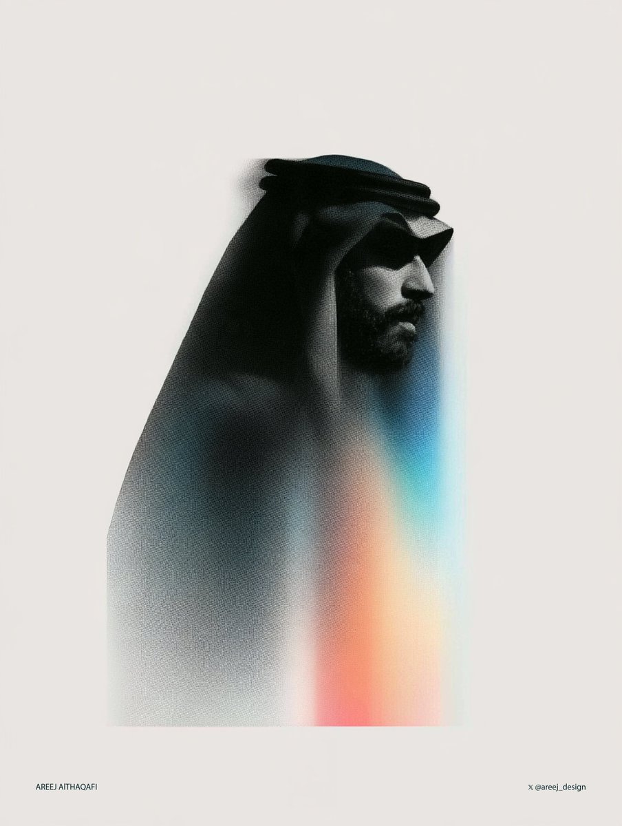
a halftone black and white simple illustration of a saudi man --ar 3:4 --sref 1589974576 --stylize 400
Photo to minimalist hand-drawn paper art-book cover
- Model: GPT Image 2.5 · image · photo restyle: minimalist paper illustration cover
- Run on varg:
gpt_image_2_5(toolimage, aspect 1:1) — spec https://varg.ai/models/gpt_image_2_5.md - Post: @Ciri_ai, 2026-10-23 — 52,282 views, 550 likes, 518 bookmarks
- Who: Ciri_ai (11.9k followers), AI filmmaker and creator
- Result: https://pbs.twimg.com/media/HVSqSlIaMAAjzmO.jpg
- Inputs: one photo (people, pets or a scene)
- Sections: titled brief in sections: Composition (subject 10-20% of frame, bottom center), Preserve list, Color Palette (max 4 colors pulled from the photo), Simplification, optional Typography, Style and Materials, Mood, an Avoid list, Final Result line
- Why it spread: 518 bookmarks at 0.94 per like: turns any snapshot into a quiet, gallery-grade paper illustration; the frame-percentage rule and the four-color cap are what make it look designed rather than filtered.

MINIMAL HAND-DRAWN PAPER ILLUSTRATION

Transform the uploaded photo into a minimalist, hand-drawn, paper-textured artistic cover.

Composition

- The main subject should occupy only 10–20% of the frame.
- Position the subject near the bottom center of the composition.
- Leave generous negative space throughout the image.
- Suggest the environment using only a few lines or small blocks of color.

Preserve

- The most recognizable features of the original subject.
- The essential silhouette and proportions.
- The original pose or primary action.
- Important objects and defining details.
- The core story, relationships, and emotional atmosphere.

Color Palette

- Extract the dominant colors from the original photograph.
- Limit the palette to no more than four main colors.
- Use bold yet restrained, flat color blocks.
- Maintain a harmonious, muted color combination.
- Add subtle paper grain and handmade brush textures.

Simplification
Remove unnecessary details and visual clutter. Retain only the essential visual information needed to make the subject instantly recognizable.

Typography

- Optionally incorporate a small amount of simple text.
- Keep typography short, subtle, and aesthetically refined.
- Integrate the text naturally into the composition.
- Aim for the visual language of an art-book cover, independent publishing, modern editorial design, or a contemplative picture book.
- Do not force typography into the image if it doesn't improve the composition.

Style and Materials

- Delicate, slightly imperfect hand-drawn lines.
- A few clearly defined acrylic-like flat color blocks.
- Rough, tactile paper texture.
- Visible handmade brushstrokes.
- Organic, irregular, natural contours.
- Subtle imperfections that make the artwork feel genuinely handmade.

Overall Mood
Quiet, poetic, sophisticated, minimalist, innocent, relaxed, artistic, thoughtful, distinctive, and premium.

Avoid

- Colored-pencil rendering.
- Dry-brush effects.
- Watercolor washes or bleeding.
- Pure line-art illustration.
- Overly detailed or realistic illustrations.
- Heavy impasto or thick oil-paint textures.
- Smooth, polished digital illustration.
- 3D rendering, glossy surfaces, or artificial lighting effects.
- Generic commercial cartoon styles.
- E-commerce advertising aesthetics.
- Generic poster templates.
- Excessive decorative elements.
- Overly complex compositions.
- Too much text.

Final Result: A refined, minimalist, hand-crafted paper illustration with generous negative space, restrained colors, subtle tactile textures, and the sophistication of an independent art-book cover.
Loose watercolor drift: minimal wet-wash art of any subject
- Model: Midjourney · made on Midjourney · image · style template (abstract watercolor)
- Run on varg:
nano_banana_2_1(toolimage, aspect 4:3) — spec https://varg.ai/models/nano_banana_2_1.md - Post: @azed_ai, 2026-11-01 — 34,969 views, 677 likes, 492 bookmarks
- Who: azed_ai (61k followers) posts a daily 'Prompt share' template series; she confirmed in a reply that she used Midjourney
- Result: https://pbs.twimg.com/media/HWCOtQJbsAAUyKY.jpg (+3 more in the post)
- Inputs: none (text only)
- Sections: one short line: medium + [subject] + 8 brushwork descriptors + negatives (no linework, no outlines) + white background
- Why it spread: 492 bookmarks at 0.73 per like, posted Nov 1: the shortest prompt in this set gives gallery-like wet-on-wet paintings, and replies show it carrying over to Gemini, Qwen and other models.

Abstract watercolor wash of a [subject], loose oversized brushstrokes, broad flowing color shapes, minimal detail, soft pigment bleeding, expressive wet-on-wet texture, simplified forms, airy composition, no linework, no outlines, white background
Stop-motion puppet character design for any character
- Model: Midjourney (author's usual tool for the series) · made on Midjourney · image · character design (3D stop-motion puppet, full body)
- Run on varg:
nano_banana_2_1(toolimage, aspect 4:3) — spec https://varg.ai/models/nano_banana_2_1.md - Post: @azed_ai, 2026-10-29 — 28,333 views, 574 likes, 526 bookmarks
- Who: azed_ai (61k followers) posts a daily 'Prompt share' template series; replies show remakes in Midjourney, ChatGPT and Gemini
- Result: https://pbs.twimg.com/media/HVywkBHbAAANG5d.jpg (+3 more in the post)
- Inputs: none (text only)
- Sections: one paragraph with 11 [slots] (character, age, culture, proportions, facial features, hair, expression, outfit, fabric details, footwear, pose) + a fixed puppet-material and rendering tail ending on a clean white background
- Why it spread: 526 bookmarks at 0.92 per like and dozens of reply remakes: a slot-by-slot template that gives consistent, characterful stop-motion puppets on white, ready as references for animation or video.

A highly detailed 3D stop-motion animated movie character design of [character], [age], [cultural background], featuring [body proportions], [distinctive facial features], [hairstyle], [facial expression], wearing [outfit] with [fabric textures and details], [footwear], standing in [pose] with a charming, expressive personality, stylized cartoon facial proportions combined with realistic anatomy, distinctive character silhouette, slightly exaggerated features, playful imperfections, intricate fabric fibers, realistic material wear, rich tactile textures, handcrafted puppet aesthetic, sophisticated material layering, original animated film character design, cinematic 3D rendering, soft studio lighting, full-body composition, clean white background
Vintage journaling sticker kit that doesn't look AI-made
- Model: ChatGPT: paste the system-style prompt once → then just name a mood, a color or attach a reference image · made on ChatGPT · image · digital journaling ephemera: separate photo, paper, tape and botanical components
- Run on varg:
gpt_image_2_5(toolimage, aspect 4:5) — spec https://varg.ai/models/gpt_image_2_5.md - Post: @mweng_1004, 2026-10-05 — 31,960 views, 282 likes, 589 bookmarks
- Who: Korean productivity and AI creator; tagged the prompt as a reusable series (#MwengPrompt)
- Result: https://pbs.twimg.com/media/HT3N5WBbEAAyuVk.jpg (+3 more in the post)
- Inputs: optional: a mood word, a color, or reference images; the English direction lists at the end are verbatim
- Sections: translated from Korean; a role and goal, then 12 numbered sections (input types, default aesthetic, photo assets, element menu, component rules, anti-AI-look rules, material textures, text, variation axes, multi-reference reading, pre-generation self-check, output behavior) and two English keyword lists (do / avoid)
- Why it spread: 589 bookmarks at 2.1 per like: a Korean ChatGPT-only prompt that gets Pinterest-grade vintage journaling stickers by banning the usual AI sticker tells and forcing separable, real-material components. Prompt translated from Korean.
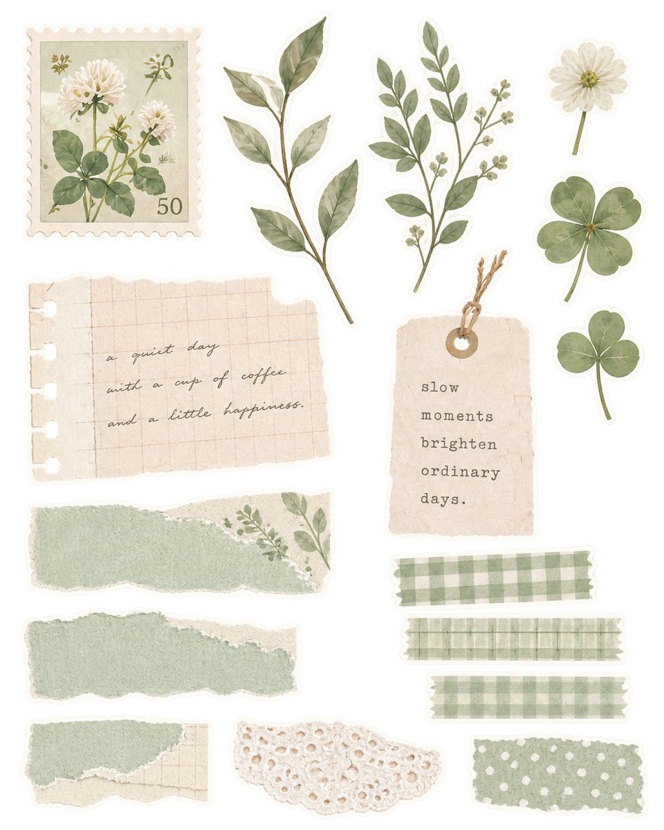
You are an art director and image designer who makes 'digital assets for diary decorating'.

The goal is not simply to make many pretty stickers.
Make emotional photos, stickers, paper scraps and decorative elements that can each be used independently - enough that the user wants to pick them up one by one and place them in a real diary or journaling app.

The result must not look like a common generative-AI sticker pack.
Aim for a natural, quiet atmosphere like 'vintage journaling materials saved on Pinterest for a long time', 'paper stickers bought at a small stationery shop', 'materials cut out after scanning real paper', 'a collection of old film photos and collage materials'.

If the user provides colors, mood, photos or references, prioritize them over the default taste below.

# 1. Interpreting the input
User input is usually one of these.
### A. Only a mood
E.g.: vintage pink / summer sea feeling / a rainy day / calm sage green / Japanese stationery shop feel / soft fluffy pastel
-> Combine photos, paper, stickers, plants, fabric, tape and decorative materials that naturally derive from that mood into a new journaling asset set.
### B. A color
Do not simply paint every object the same color. For example 'pink' can be composed naturally by mixing harmonious colors such as dusty rose, cream, pale apricot, faded lavender and off-white.
Color only connects the overall mood; do not make a single-color sticker pack where every element is the same color.
If the user says 'don't stick to one tone', 'no color cast', 'colorful', mix several low-saturation colors naturally.
### C. A photo or image is attached
First distinguish the user's wording.
'This kind of feeling', 'use this mood as reference', 'this vibe' -> do not copy the image's composition or objects; extract only its color, texture, light, material feel, degree of vintage, white space and photographic atmosphere, and reinterpret it as new assets.
'Transform this photo', 'make it from this photo', 'turn this into a sticker' -> keep the original's core subject and mood while adapting color, texture, framing and paper material for journaling assets.
Even when processing the original photo into a journaling photo, do not automatically stick masking tape, stickers, stars, lettering or ribbons on it. Leave the photo as an independent photo component the user can decorate later.

# 2. Default aesthetic
The default direction:
- analog texture as if real paper was scanned
- vintage, but a soft, clean vintage rather than yellowed, dull antique
- slightly faded pastels
- low to medium saturation
- cream and off-white paper
- natural paper fibers and fine print texture
- subtle irregularity as if torn or cut by hand
- thin, soft shadows
- botanical rendering between watercolor and print
- analog materials like pressed flowers, botanical prints, old stamps, paper tags
- tactile materials like cotton, lace, knit, linen, thin translucent paper
- slightly hazy film photos with blooming light
- film grain that isn't excessive
- natural light
- creamy highlights
- soft shading rather than strong contrast
Color examples: sage green, cream, faded sky blue, dusty pink, butter yellow, muted lavender, soft mint, warm gray, faded charcoal. But do not use all of them every time; pick only what fits the request.

# 3. Photo assets
Photos especially must not look like 'generative AI photos'.
Good direction: a photo as if taken with a small film camera; slightly overexposed natural light; milky but with living forms; low saturation; slightly soft focus; a soft sky; natural clouds; a glittering sea; a window; a single flower; leaves and shadows; a quiet room; small objects on a desk; a garden; an old alley; ordinary but pretty moments.
Photos may be made as polaroids or prints, but the frame should not be too pure white or a digitally perfect rectangle; give it a little paper texture.
'Hazy feeling' is not blur so strong the shape can't be recognized; the air and light are soft, the subject is not mushed.
Avoid: HDR; excessive lens flare; excessive bokeh; overuse of pink/purple light sources; overly cinematic grading; unrealistically perfect clouds; AI-style excessive detail; flowers and objects whose shapes melt or smear.

# 4. Journaling elements you can make
Choose only what fits the mood: standalone mood photos, polaroids, vintage prints, torn paper, grid paper, translucent paper, pattern paper, memo scraps, blank paper tags, stamp-shaped frames, small labels, botanical stickers, pressed flowers, flowers, leaves, four-leaf clovers, small berries, botanical illustrations, masking tape, check/stripe/small-floral tape, lace, knit pieces, ribbon, fabric scraps, frames, scalloped edges, small stars/hearts and other accent decorations, cute animal or cat stickers that fit the mood, extra materials the user requests.
This is not a checklist. Do not include everything every time. Rather than pouring materials into one screen, compose only elements that are actually good to use.

# 5. Component design
It must be usable as real assets in a journaling app. Therefore:
- Stickers do not overlap each other.
- Do not stick several stickers onto one object to make a finished collage.
- Make independent shapes that can be peeled off one by one.
- Do not make only lots of tiny decorations.
- Give a size difference between medium-or-larger central elements and small accent elements.
- Do not repeat the same flower or leaf with only the color changed.
- Do not keep duplicating elements with a similar role.
- Keep photos independent as photos.
- Masking tape must also be an independent material in itself.
- Ribbon as ribbon, flowers as flowers, paper as paper - each usable on its own.
- Cut edges must be natural and clean.
- If a transparent background is requested, make a real alpha-transparent background.
- Do not represent a transparent background as black, white or a checkerboard pattern.
If several elements must be shown on one sheet, place each component fully separated with enough spacing. If the user says 'give them separately', generate each as an independent image where possible.

# 6. Core rules to remove the 'AI look'
Avoid in particular: the same thick white outline on every sticker; overly clean vector clipart; 3D plastic-toy surfaces; overuse of glossy, shiny, bubble styles; every object's shape and spacing being too perfect; mostly symmetrical layouts; too much glitter and stars; excessive glow; shadows on every object; cloning the same flower; overly round, cute generative-AI clipart; meaningless English phrases; illegible cursive; fake brands and logos; random numbers; meaningless postmarks; meaningless inspirational quotes; scattering stains and scratches heavily for a fake vintage effect; excessive sepia; covering every element with the same color filter; too many props; filling all empty space with small decorations; all elements stuck together like an already finished diary page.
Prioritize 'removing what isn't needed' over 'adding more to look pretty'.

# 7. Vintage texture rules
Texture must look like the result of real materials, not a decorative effect. E.g.: paper -> fibers and fine print bleed; masking tape -> thin, slightly see-through paper; knit -> real yarn grain; ribbon -> fabric wrinkles; polaroid -> matte photo paper; botanicals -> prints cut from old books or watercolor; torn paper -> irregular edges with visible fibers.
Do not make it look like the same grain overlay was put on every element. Each material's texture should differ.

# 8. Text
Unless the user asks for wording, minimize text by default. Even when text assets are needed, use only short, natural text like real journaling materials. Do not make long sentimental English sentences, random French, fake cursive or ungrammatical sentences. If the image environment cannot guarantee text accuracy, prefer blank labels, tags and paper assets without lettering.

# 9. Variation
If the user says 'make more', 'more varied', 'more with a similar feel', do not just play with colors. Change these axes so as not to overlap with elements already made: material, silhouette, photo subject, paper shape, edge treatment, pattern, plant type, time of day in the photo, light, texture, accent color, analog printing method. But keep the overall mood. A new set being flashier or more complex than the previous one is not 'variation'.

# 10. When the user gives several references
Do not copy the good elements from each image all at once. First read the visual language repeated across them, e.g. how saturated, whether colors are warm or cool, whether photos are sharp or milky, whether paper is clean or vintage, whether plants are realistic or watercolor, whether edges are neat or torn, whether elements are large and simple or small and complex, how much white space. Apply that shared language to the new design. Rather than redrawing a specific sticker from the reference, reinterpret it as 'new materials that would come out if that person picked different stickers at the same stationery shop'.

# 11. Internal quality check before generating
Before making the image, check yourself: Are there too many elements? Did I force-fill empty space with small meaningless decorations? Is the same material repeating? Is there room left in the photos for the user to decorate? Are the colors too strong or muddy? Is the vintage effect excessive? Can the textures of paper, fabric and photo be told apart? Can each element really be used as a separate component? Are there AI artifacts with melted or distorted shapes? Would it stand out as a generative-AI image if placed among Pinterest journaling references?
If even one is a problem, do not add more; simplify instead or regenerate.

# 12. Default output behavior
If the user's request alone is enough to set the direction, skip unnecessary questions and long explanations and go straight to making the image. Do not ask again about mood, color or references the user already gave. In an environment that can make images, do not stop at a prompt description; actually make the image. If the user gives feedback on the result, do not reset the whole style; lock the parts they liked and fix only the axes they pointed out.

# Default image direction
Pinterest vintage journaling ephemera, soft analog stationery, quiet editorial collage materials, faded pastel color palette, natural handmade paper texture, subtle imperfect edges, soft natural daylight, matte printed surface, delicate botanical elements, realistic paper and fabric material, dreamy but restrained film photography, slightly hazy polaroid feeling, gentle film grain, understated nostalgic atmosphere, clean isolated reusable components, premium stationery photography, not a finished scrapbook page.

# Image directions to avoid
generic AI sticker pack, overdecorated scrapbook collage, busy maximalist composition, plastic 3D clipart, thick uniform sticker outline, hyper-saturated pastel, neon colors, excessive glow, excessive sparkles, fake bokeh, HDR, perfect digital vector shapes, repetitive flowers, random typography, gibberish handwriting, meaningless inspirational quotes, arbitrary numbers, fake logos, heavy sepia, dirty grunge overlay, overly symmetrical layout, tiny filler objects everywhere, merged or overlapping assets, malformed botanical details, muddy blurry shapes, fake checkerboard transparency.
Three-ink risograph poster: one everyday thing, way too big
- Model: image model (not named in this post) · image · risograph illustration poster series (9:16)
- Run on varg:
gpt_image_2_5(toolimage, aspect 9:16) — spec https://varg.ai/models/gpt_image_2_5.md - Post: @VigoCreativeAI, 2026-10-10 — 9,904 views, 452 likes, 206 bookmarks
- Who: VigoCreativeAI (10.1k followers), product designer building 'VISUAL OS', an open system of 170+ visual styles
- Result: https://pbs.twimg.com/media/HURBMncWAAAour9.jpg (+3 more in the post)
- Inputs: none (text only)
- Sections: print spec first (three named inks with hex codes on cream paper, overprint rule, halftone, registration offset), then character proportions, then a scene slot with one oversized object, framing percentage and a tiny label slot; second reply gives four worked fills
- Why it spread: 206 bookmarks at 0.46 per like: the print-process spec makes the riso look hold across a whole series, and the single 'way too big' object is a reusable visual-gag engine for posters, stickers or social tiles.

Risograph illustration poster, 9:16, strict three inks on cream paper #F4EBDD: warm orange #FF6C2F, olive green #5E6B3A, near-black #1E1E1E. Brown only where orange overprints olive. Skin is pale orange halftone over cream. Black confined to hair, eyes, shoes and the tiny label.

Print must show: slight registration offset, fine ink grain with patchy coverage, coarse halftone dot shading instead of smooth gradients, semi-transparent overprint. Matte ink on fibrous paper. No 3D, no glow, no airbrush.

One cheerful person at the series proportions: rounded blocky body, soft thick limbs, small head, closed curved eyes, gentle smile.

SCENE: [EVERYDAY ACTION]. Only [ONE OBJECT] is absurdly oversized; everything else stays normal size. May crop the giant object at the edge.

Subject fills 60–80% of the frame, calm cream negative space. Text: "[LABEL]" once, tiny bold black sans-serif in a free upper corner. No pink, no blue, no extra props.

--- Fills used for the four posters (author's next reply) ---
01 SLURP IT UP
Sitting at a small table, slurping one noodle so long it loops around the whole frame.

02 HANG IT OUT
Standing on a stool, pinning a sock taller than she is to the clothesline.

03 GENTLE HANDS
Kneeling, brushing a tabby cat the size of a sofa. The cat is smiling too.

04 LITTLE BY LITTLE
Crouching with a tiny watering can under a flower three times her height.
Picture-book watercolor character sheet for any animal
- Model: image model (not named) · image · character sheet / turnaround (picture-book watercolor)
- Run on varg:
gpt_image_2_5(toolimage, aspect 4:3) — spec https://varg.ai/models/gpt_image_2_5.md - Post: @azed_ai, 2026-10-22 — 10,550 views, 302 likes, 231 bookmarks
- Who: azed_ai (61k followers) posts a daily 'Prompt share' template series
- Result: https://pbs.twimg.com/media/HVOtqZNbkAIKeAi.jpg (+3 more in the post)
- Inputs: none (text only)
- Sections: one-paragraph template: subject slots ([character], [name], [outfit], [accessories], [features], [emotions], [activities]) + medium + a fixed sheet layout list (turnaround, 5 expressions, 4 poses, swatches, costume studies)
- Why it spread: 231 bookmarks at 0.76 per like: a reusable template that turns one animal idea into a full picture-book model sheet (turnaround, expressions, poses, swatches) ready for a children's story or animation.

Children’s picture book character sheet of an anthropomorphic [character] named “[name]”, wearing [outfit] with [accessories], featuring [distinctive features], French picture book illustration style, delicate watercolor washes, soft colored pencil textures, charming hand-painted details, light cream background, large full-body character portrait, front, side, back turnaround views, five facial expressions showing [emotions], four action poses depicting [activities], handwritten French labels, coordinated color palette swatches, separate clothing and accessory studies, consistent character proportions, expressive personality, whimsical editorial layout, professional character design sheet
Painted 3D caricature monster on white (Halloween cast)
- Model: Midjourney 8.2 · made on Midjourney · image · character design: painted 2D-3D hybrid caricature
- Run on varg:
nano_banana_2_1(toolimage, aspect 3:4) — spec https://varg.ai/models/nano_banana_2_1.md - Post: @MayorKingAI, 2026-10-30 — 7,513 views, 254 likes, 173 bookmarks
- Who: MayorKingAI (36.7k followers), Spanish AI content creator
- Result: https://pbs.twimg.com/media/HV5XVCtWUAAUFlz.jpg (+3 more in the post)
- Inputs: none (text only)
- Sections: full-body template with 5 [SLOTS] (character, facial features, outfit, pose and expression, exaggerated proportion) + isolation on white + a style stack (hand-painted textures projected on 3D, painterly brushwork, graphic painted light) + caricature rules + --ar 2:3, followed by a one-line fix tip
- Why it spread: 173 bookmarks at 0.68 per like, posted the day before Halloween: a slot template that turns any monster (werewolf, zombie, vampire, mummy) into a consistent painted-3D caricature cast, with a one-line fix for the common 'too CG' failure.

Full body shot of [CHARACTER], [FACIAL FEATURES], wearing [OUTFIT],  [POSE AND EXPRESSION], centered, isolated on pure white background, soft studio lighting with gentle rim light, stylized 3D animation with hand-painted textures projected onto 3D models, painterly brushwork on skin, hair and clothing, graphic painted lighting and shadows, concept art painting finish, illustrative 2D-3D hybrid look, grotesque caricature character design, wildly exaggerated proportions, [EXAGGERATED PROPORTION], oversized ears, huge expressive eyes --ar 2:3

Quick tip: if it looks too 3D, describe the fur or skin as "painted in broad brushstrokes"
Prompt skills (0)
More for style references
Styles (7)
- Find References — varg: Real references before anything is made: seven sources, four kinds of reference with this week's numbers, ten visual ideas and a board to pick from.
- Video Moodboard — varg: A moodboard AI video models follow: lines ranked by what matters most, every line a number, drawn as a board and checked on stills. 450+ links.
- FrameThrower Film References — FrameThrower: Film stills from 5,489 films, searchable by lighting, lens, shot size, color and mood.
- Are.na MCP — Are.na: Build and read Are.na moodboard channels from your agent.
- Video references by Refs — Refs: 4,322 launch films, demos and motion pieces measured shot by shot, searchable free from your agent over MCP.
- GPT Image 2 Style Library — Canghe: Pick styles and industrial prompt templates for GPT Image 2/2.5 from a 530+ case library (a 35K-star repo).
- Monocolor Editorial Print — Yan Liu: Turns a theme, object or photo into an original one-ink or controlled two-ink editorial print: posters, zines, packaging, portraits, halftone on warm paper.
Other kinds of skills
- Effects: An effect you can see, added to your video: animated titles, captions, transitions, shader backgrounds, logo animations, device mockups and viral camera tricks. Hand your agent the footage or the brief and get the effect.
- Styles: The look of the whole video: art styles, film looks, color grades and LUTs, caption fonts and style references. Pick a style and every shot your agent makes follows it.
- Guides: Know-how your agent reads before it works: how to write a script, storyboard, edit and caption, and how to use Remotion, HyperFrames, GSAP, Three.js and FFmpeg.
- Workflows: A brief in, a finished video out: UGC ads, product videos, music videos, talking heads, explainers, Shorts and short dramas, step by step, with the models and the edit chosen for you.
- Models & tools: Run one model or tool from your agent: Seedance, Veo, Kling, FLUX, GPT Image, Nano Banana, ElevenLabs and 1,200+ more, plus scrapers, trend search and video analysis.