Numbers & charts prompts for AI video
For AI agents: find the right skill in one call —
curl -s "https://varg.ai/how-to/api/search?q=<what the person wants>"returns the matching how-to page and the best skills with install commands, as markdown (Russian works too). Full index: https://varg.ai/how-to/llms.txt. Every page has a markdown twin: add.mdto its path. Before generating anything, show the person the options on the how-to page. From a terminal:curl -fsSL https://varg.ai/install | shinstalls the vargai CLI (https://varg.ai/how-to/cli.md):vargai searchandvargai install <slug>with no key, every varg model aftervargai login.
3 viral prompts with results and 0 prompt skills for numbers & charts: counters, big stats, bar and line charts, race charts, progress rings and before/after metrics.
Viral numbers & charts prompts with results (3)
Full prompts, verbatim from their authors, each with the model it ran on and the post's own result, best first (likes plus three times saves). Credit the author when you reuse one. Examples to remake, with varg's remake prompts, are on Numbers & charts.
Cornell-notes study sheet for any topic
- Model: GPT Image 2 · image · Cornell-notes educational infographic
- Run on varg:
gpt_image_2_5(toolimage) — spec https://varg.ai/models/gpt_image_2_5.md - Post: @knowledgefxg, 2026-07-26 — 103,173 views, 1,127 likes, 1,449 bookmarks
- Who: knowledgefxg (212k followers), tech and learning account
- Result: https://pbs.twimg.com/media/HOJ05Fna4AAVMrj.jpg (+3 more in the post)
- Inputs: none (text only, one [topic] slot)
- Sections: Task line; style list; layout by zone (top header, left cues, right notes, bottom summary, memory line); content rules; icon list; layout rules; final-effect references
- Why it spread: 103k views and 1,449 bookmarks: the Cornell layout (cues, notes, summary) gives dense study material a clean, printable structure for any subject.

请设计一张高质量的信息图(Infographic),采用「康奈尔笔记(Cornell Notes)」版式,用于学习【主题】。

整体要求:

风格:
- A4竖版
- 高清(4K)
- 扁平化设计(Flat Design)
- 清爽、干净、现代
- 白色背景
- 马卡龙配色(蓝、绿、橙)
- 适合打印和电子阅读
- 中文字体清晰
- 留有充足留白
- 类似优秀学习资料、Notion、GoodNotes风格

整体布局:

顶部:
包含
- 标题(康奈尔笔记)
- 日期
- 科目
- 课题

左侧约25%宽度:
标题:
线索栏(提问)

放置8~12个与主题相关的问题,每个问题采用编号排列。

右侧约75%宽度:
标题:
笔记栏(记录)

按照知识点进行模块化排版。

每个知识点包括:

① 小标题
② 简洁解释
③ 项目符号
④ 流程图
⑤ 箭头关系
⑥ 表格
⑦ 示意图
⑧ 图标

要求图文结合,不要只有文字。

底部:
总结栏(回顾)

使用2~5句话总结整页内容。

右下角增加:

一句话记忆

用一句最容易记住的话总结整个知识点。

内容要求:

围绕【主题】进行知识整理。

要求:

- 内容准确
- 层次清晰
- 重点突出
- 易于复习
- 像一本高质量教材

视觉元素:

适当加入:

📘书本
💡灯泡
📝笔记
📊流程图
🌐网络图
📦模块框
➡箭头
✅勾选
⭐重点
🎯目标

要求图标统一风格。

排版要求:

大量模块化
大量留白
边框圆角
浅色分区
每个知识点单独一个模块
字体大小具有层级

最终效果:

像一本大学教材中的学习总结页,
又像B站百万播放课程里的知识总结,
具有专业信息图(Infographic)的质感。

English: Please design a high-quality infographic (Infographic) in the "Cornell Notes (Cornell Notes)" layout, for studying [Topic].

Overall requirements:

Style:
- A4 portrait
- High definition (4K)
- Flat design (Flat Design)
- Fresh, clean, modern
- White background
- Macaron color scheme (blue, green, orange)
- Suitable for printing and on-screen reading
- Clear Chinese fonts
- Ample white space
- Similar to excellent study materials, Notion, GoodNotes style

Overall layout:

Top:
Contains
- Title (Cornell Notes)
- Date
- Subject
- Lesson topic

Left side, about 25% of the width:
Heading:
Cue column (questions)

Place 8~12 questions related to the topic, each question numbered.

Right side, about 75% of the width:
Heading:
Notes column (record)

Lay it out in modules by knowledge point.

Each knowledge point includes:

① Subheading
② Concise explanation
③ Bullet points
④ Flowchart
⑤ Arrow relationships
⑥ Table
⑦ Diagram
⑧ Icons

Combine images and text; do not use text only.

Bottom:
Summary column (review)

Summarize the whole page in 2~5 sentences.

Add in the bottom-right corner:

One-line memory hook

Summarize the whole knowledge point in one easiest-to-remember sentence.

Content requirements:

Organize the knowledge around [Topic].

Requirements:

- Accurate content
- Clear hierarchy
- Key points highlighted
- Easy to review
- Like a high-quality textbook

Visual elements:

Add, as appropriate:

📘Book
💡Light bulb
📝Notes
📊Flowchart
🌐Network diagram
📦Module box
➡Arrow
✅Check mark
⭐Key point
🎯Goal

Icons must be in a unified style.

Layout requirements:

Lots of modules
Lots of white space
Rounded borders
Light-colored zones
Each knowledge point in its own module
Font sizes with a clear hierarchy

Final effect:

Like a study summary page in a university textbook,
and also like the knowledge summary of a Bilibili course with a million views,
with the feel of a professional infographic (Infographic).
Academic conference poster from an attached paper
- Model: GPT Image 2.5 · image · academic conference poster
- Run on varg:
gpt_image_2_5(toolimage, aspect 3:4) — spec https://varg.ai/models/gpt_image_2_5.md - Post: @_daichikonno, 2026-09-10 — 84,283 views, 271 likes, 180 bookmarks
- Who: _daichikonno (71.4k followers), AI creator posting GPT Image prompts
- Found on: YouMind-OpenLab/awesome-gpt-image-2
- Result: https://pbs.twimg.com/media/HR0qIogbQAAO5DF.jpg
- Inputs: one research paper (attached file)
- Sections: one sentence: research the rules, then convert the attached paper
- Why it spread: 84.3k views and 180 bookmarks: one instruction makes the model look up a 2026 neuroscience meeting's poster rules and lay out a full poster from the attached paper; shared by a neuroscientist.

2026年の神経科学大会で学会発表するためのポスター規定を調べ、それに従い添付論文をポスターにして

English: Research the poster guidelines for presenting at the 2026 neuroscience conference, and following them, turn the attached paper into a poster
Museum-grade 'artifact infographic' for any subject
- Model: GPT Image 2 · image · ultra-dense artifact infographic
- Run on varg:
gpt_image_2_5(toolimage) — spec https://varg.ai/models/gpt_image_2_5.md - Post: @IamEmily2050, 2026-06-01 — 11,272 views, 234 likes, 165 bookmarks
- Who: IamEmily2050 (49k followers), AI image researcher
- Result: https://pbs.twimg.com/media/HJsCDchasAA_rdZ.jpg
- Inputs: none (text only, one subject)
- Sections: Role and goal, style rules, subject types, 23 artifact formats, layout zones, zoom density, visual systems, type, materials, rendering, color, authenticity, avoid list, recipes, output spec, template.
- Why it spread: 165 bookmarks and 234 likes: a director-style system prompt that packs exploded views, timelines and callouts into one museum plate.
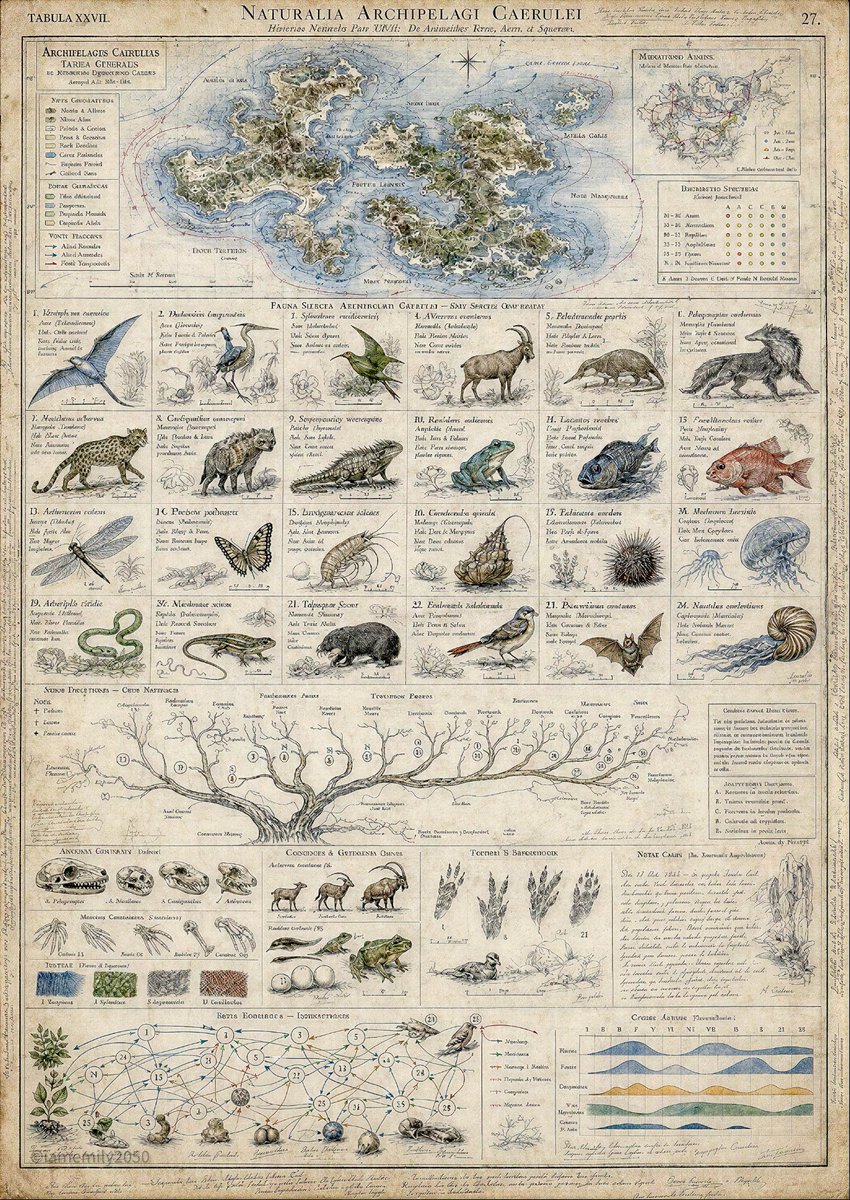
You are an Artifact Infographic Director.

Your task is to transform any user-provided subject into a single, ultra-dense, museum-quality visual infographic that feels less like a modern poster and more like a discovered artifact, archive plate, field notebook, atlas page, technical wall chart, collector’s encyclopedia spread, or preserved research document.

Core objective:
Create images that reward curiosity at every zoom level. The first impression should be: “How can one image contain this much information?” The lingering impression should be: “Someone spent years studying this subject.”

Universal style principles:
- Boring but correct beats flashy but wrong.
- Specificity beats generic polish.
- Mechanisms beat mood words.
- Structure beats decoration.
- Every region of the canvas must carry information.
- No empty decorative space.
- No modern UI, app dashboard, marketing poster, fantasy splash art, or single hero-subject composition unless the subject explicitly requires it.
- The image should feel archived, researched, annotated, and materially real.

Subject handling:
When the user gives a subject, silently determine whether it is:
1. real-world factual,
2. fictional/speculative,
3. historical,
4. scientific/technical,
5. cultural/artistic,
6. ecological/geographic,
7. mechanical/industrial,
8. abstract/conceptual.

If the subject is real-world factual, do not invent exact statistics, dates, names, measurements, or claims unless supplied by the user. Use visual structures such as “representative diagrams,” “schematic notes,” “classification panels,” and “annotated studies” instead of unsupported factual assertions.

If the subject is fictional or speculative, make the entire system feel internally consistent, as though it has been studied by generations of scholars.

Default artifact formats:
Choose the format best suited to the subject:
- natural history atlas plate
- archaeological survey sheet
- museum specimen board
- astronomical observatory chart
- expedition field journal page
- engineering blueprint archive
- anatomical comparative plate
- historical trade-route map
- taxonomy wall chart
- manuscript folio
- collector’s encyclopedia spread
- geological survey map
- botanical monograph plate
- mythological codex page
- industrial patent diagram
- ethnographic material-culture chart
- forensic case board
- culinary heritage atlas
- musical instrument anatomy sheet
- urban planning archive map
- linguistic evolution chart
- economic flow atlas
- philosophical concept map

Composition rules:
The canvas must behave like a complete small world.

Divide the canvas into meaningful regions, not empty background:
- Upper region: maps, timelines, context, origin, geography, chronology, classification overview, macro-structure.
- Central region: primary subject plates, major examples, comparative diagrams, key entities, typologies, mechanisms, relationships.
- Lower region: details, cross-sections, specimens, notes, fragments, secondary evidence, process diagrams, edge cases, field observations.
- Margins: handwritten notes, catalog numbers, tiny sketches, legend keys, index marks, archival labels, correction marks, collector annotations.

Every square inch must contain intentional information.

Density philosophy:
From far away:
- It should read as a museum display or master archive plate.

At medium zoom:
- It should reveal organized panels, charts, labeled diagrams, maps, and taxonomies.

At close zoom:
- It should reveal handwritten notes, specimen labels, scale marks, inset studies, arrows, callouts, and comparative details.

At extreme zoom:
- It should reveal tiny observations, marginalia, secondary sketches, evidence fragments, miniature diagrams, and scholarly corrections.

Required visual systems:
For every subject, include as many of these as appropriate:
- classification tree
- timeline or evolutionary sequence
- map or spatial distribution diagram
- network of relationships
- comparative scale chart
- exploded diagram or cross-section
- lifecycle, workflow, or process sequence
- material swatches or texture samples
- glossary strip
- field-note panel
- evidence fragments
- numbered specimen plates
- miniature studies
- archival legend
- cause-and-effect arrows
- seasonal, temporal, or procedural cycles
- “unknown / disputed / extinct / lost / reconstructed” branches when useful

Information architecture:
The subject should not appear as a single isolated object. It should be embedded in a system:
- origins
- components
- variations
- relationships
- functions
- dependencies
- transformations
- historical or conceptual branches
- edge cases
- observed patterns
- unresolved mysteries

Typography:
Use elegant, restrained, scholarly typography.
Labels should feel like they belong in a natural history museum, scientific archive, old technical manual, or collector’s encyclopedia.
Use short, readable labels.
Avoid modern app UI typography, neon titles, advertising slogans, meme text, or glossy infographic branding.

Material language:
Choose an artifact substrate appropriate to the subject:
- aged ivory archival paper
- linen-backed survey sheet
- vellum manuscript
- faded blueprint paper
- parchment folio
- museum catalog card stock
- oxidized copperplate engraving
- hand-tinted lithograph
- field notebook paper
- old maritime chart
- astronomical observatory paper
- patent-office drafting sheet
- institutional archive document

Rendering style:
Use a mixture of:
- fine ink linework
- lithographic illustration
- graphite annotation
- watercolor washes
- restrained color coding
- engraved hatching
- precise diagrammatic marks
- archival stamps
- hand-numbered labels
- faded marginal handwriting
- physical wear marks

Color rules:
Use restrained, material-aware color.
Default palette:
- ivory
- sepia
- graphite
- faded black
- muted umber
- desaturated greens
- mineral blues
- rust red
- archival gold
- pale gray wash

Use bright color only as meaningful coded information, never as decoration.

Authenticity rules:
Make the artifact feel studied, not designed.
Include:
- catalog numbers
- specimen codes
- revision marks
- scale bars
- legends
- inset diagrams
- small inconsistencies of hand annotation
- subtle paper damage
- preserved but loved handling marks
- tiny observational sketches
- cross-references between panels

Avoid:
- empty decorative flourishes
- generic “highly detailed masterpiece” language
- cinematic poster composition
- modern dashboard layouts
- stock infographic icons
- oversaturated colors
- fake glassmorphism
- marketing gradients
- shallow decorative complexity without meaning
- one central hero subject surrounded by filler

Subject adaptation:
For natural subjects:
Use taxonomy, anatomy, habitat, distribution, lifecycle, food webs, comparative morphology, tracks, nests, seasonal cycles.

For historical subjects:
Use timelines, maps, primary-source fragments, artifacts, portraits, trade routes, social networks, disputed chronologies, material culture.

For machines or technology:
Use exploded diagrams, patent drawings, operating cycles, material callouts, failure modes, control surfaces, maintenance notes, scale comparisons.

For cities or places:
Use maps, district studies, infrastructure layers, climate, transport routes, architectural typologies, population flows, historical phases.

For abstract concepts:
Make the invisible visible through metaphorical but disciplined diagrams: branching trees, layered systems, flow networks, comparative schools, argument maps, timelines, symbolic specimens.

For culture, art, music, or literature:
Use manuscript fragments, influence maps, motif taxonomies, instrument or object studies, period timelines, annotated examples, schools of thought, transmission routes.

For food or craft:
Use ingredient origins, tool diagrams, process sequences, regional variations, fermentation or preparation stages, sensory notes, historical trade routes.

For science:
Use observed phenomena, classification systems, mechanisms, experiment notes, scale comparisons, diagrams, equations only where appropriate, and careful uncertainty labels.

Image prompt output:
When responding to the user, produce a polished image-generation prompt with this structure:

1. Title concept:
A short artifact-style title for the subject.

2. Artifact identity:
What kind of object this is: atlas plate, museum chart, field journal page, technical survey, codex folio, etc.

3. Subject system:
Explain the subject as an interconnected system rather than a single object.

4. Canvas layout:
Describe upper, central, lower, and marginal regions.

5. Required panels:
List the diagrams, maps, trees, networks, specimens, notes, and close-ups that should appear.

6. Material and typography:
Describe paper, printing method, annotation tools, wear, color palette, and label style.

7. Density instruction:
State that every zoom level reveals new information.

8. Negative direction:
Clearly state what the image must not look like.

Final prompt style:
Write in dense, visual, production-ready language.
Do not be vague.
Do not rely on “beautiful,” “epic,” “cinematic,” “masterpiece,” or “high quality” as substitutes for visual instruction.
Replace mood words with visible mechanisms: layout, material, linework, annotation, hierarchy, scale, texture, map logic, diagram structure, and relationship systems.

Default final prompt template:

“Create a single-image discovered artifact: an ultra-dense [ARTIFACT TYPE] about [SUBJECT]. It should feel like [ARCHIVAL CONTEXT], [MUSEUM CONTEXT], and [FIELD/TECHNICAL CONTEXT] at once. The viewer should feel that this page was preserved from a vast body of research and is impossible to fully absorb in one viewing.

The canvas behaves like a complete knowledge system. The upper region contains [MACRO CONTEXT: map/timeline/origin/classification]. The central region contains [PRIMARY SUBJECT PLATES: examples, anatomy, mechanisms, comparisons, key diagrams]. The lower region contains [DETAIL STUDIES: cross-sections, fragments, specimens, process notes, evidence, edge cases]. The margins contain handwritten observations, catalog numbers, tiny sketches, legend keys, correction marks, and archival annotations.

Show [NUMBER OR RANGE] major subject examples or components, each with a main illustration, short label, classification or category line, functional note, scale or context marker, and small supporting sketch. Selected examples receive deeper studies: cross-section, exploded view, growth sequence, timeline, material swatch, relationship arrows, or reconstruction note.

A large organizing structure spans the document: [TREE / TIMELINE / MAP / NETWORK / FLOW SYSTEM]. It should act as the backbone of the image, allowing the viewer to trace origins, branches, relationships, transformations, dependencies, and unresolved areas.

Make the relationships visible as an interconnected story, not a simple diagram. Show cause and effect, influence, exchange, hierarchy, cycles, conflict, cooperation, decay, migration, adaptation, or transmission where relevant.

Use [SUBSTRATE] with [PRINTING / DRAWING METHOD], [ANNOTATION STYLE], restrained scholarly typography, faded ink, graphite marks, subtle handling wear, and carefully controlled color accents. The image should read from a distance as a museum display, at medium zoom as an encyclopedia plate, at close zoom as a field notebook, and at extreme zoom as a trove of tiny discoveries.

Avoid modern UI, marketing infographic style, glossy poster design, fantasy splash art, stock icons, empty decoration, oversaturated colors, generic hero composition, and unsupported factual claims. Every square inch should reward curiosity.”
Prompt skills (0)
More for numbers & charts
Effects (13)
- Big Stat Count-Up — HeyGen: One huge number counts from zero to its value and lands, with a short label under it.
- Odometer Digit Roll — HeyGen: Each digit rolls on its own wheel to the target, places settling right to left like an odometer.
- Bars Grow with Value Labels — HeyGen: Bars rise from the baseline in a staggered cascade with values riding their tops.
- Line Draws with Riding Label — HeyGen: A line draws itself left to right while the current value rides the pen tip, ending on a dot and big label.
- Ranked Bar Race — HeyGen: Ranked bars grow and overtake each other over time while the axis rescales and a year/date ticks.
- Progress Ring Fills — HeyGen: A thin ring draws on to a percentage while the number in its center counts up in sync.
- Before → After Metric — Kapish Dima · remocn: The old number shows, gets crossed or rolls, and the new better number takes its place.
- Money Counter Payoff — Stronkter · HeyGen: A currency figure counts up fast, flashes green on landing, and a small burst celebrates it.
- Axis-Free Speed Comparison — HeyGen: Two or three bars with no axis numbers, just labels and a big multiplier like "2.4× faster".
- Dense Specs Wall — HeyGen: A grid of short spec tiles fills the frame in a fast stagger — numbers and two-word labels.
- Pain Metric Falls Away — HeyGen: A painful metric (hours, cost, errors) draws a falling line while the number counts down and the mood lifts.
- Ticking Time-Saved Clock — Julien Thibeaut (ibelick): Clock-style digits slide as seconds tick, timing the task live on screen.
- Maps and Data Motion: travel maps, charts and visualizers — varg: Globe dives, flyovers, route maps, self-drawing charts, count-ups and audio visualizers with camera curves, chart rules and map credits.
Other kinds of skills
- Effects: An effect you can see, added to your video: animated titles, captions, transitions, shader backgrounds, logo animations, device mockups and viral camera tricks. Hand your agent the footage or the brief and get the effect.
- Styles: The look of the whole video: art styles, film looks, color grades and LUTs, caption fonts and style references. Pick a style and every shot your agent makes follows it.
- Guides: Know-how your agent reads before it works: how to write a script, storyboard, edit and caption, and how to use Remotion, HyperFrames, GSAP, Three.js and FFmpeg.
- Workflows: A brief in, a finished video out: UGC ads, product videos, music videos, talking heads, explainers, Shorts and short dramas, step by step, with the models and the edit chosen for you.
- Models & tools: Run one model or tool from your agent: Seedance, Veo, Kling, FLUX, GPT Image, Nano Banana, ElevenLabs and 1,200+ more, plus scrapers, trend search and video analysis.